Exiro Nickel - Critical Minerals Exploration Company
Exiro Nickel recherchait un logo design et a reçu 337 logo designs Élégant, Léger, Nickel Mining de 108 designers
Designs
Designers
Budget


1 - 20 de 337 Propositions de %
C'est ce que Exiro Nickel recherchait dans leur logo design
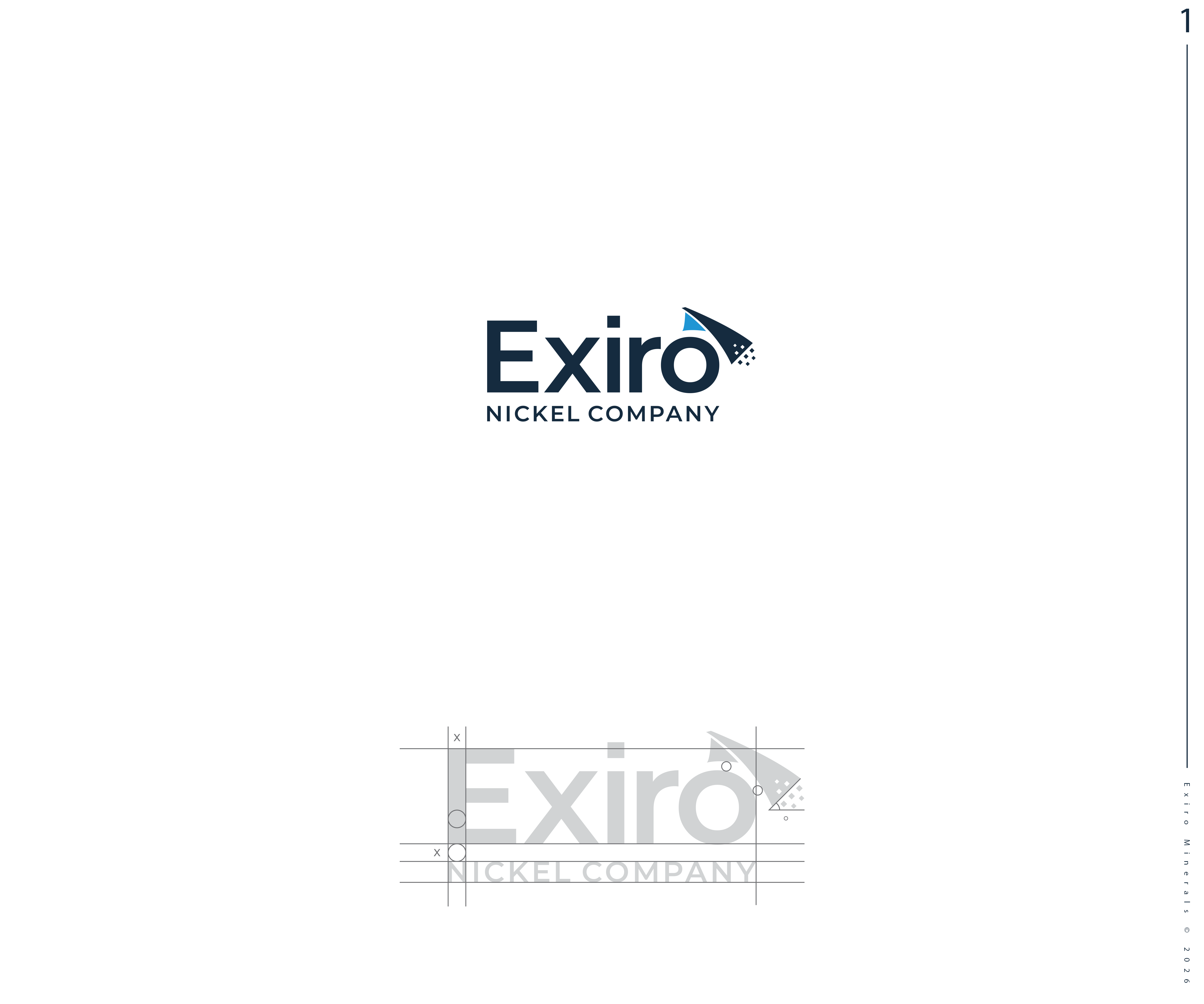
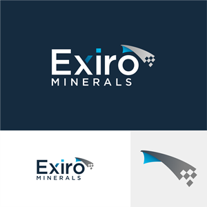
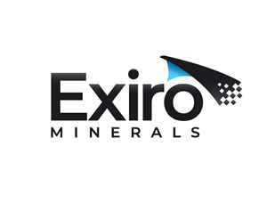
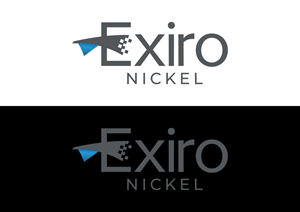
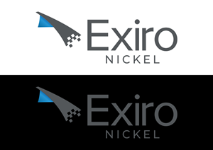
SLIGHT UPDATES to existing logo.
Have attached existing logo and notes for improvement:
1. Strengthen the Symbol (Corner Fold + Pixel Scatter): simplify the pixel cluster: reduce the number of squares and/or group them more clearly to avoid visual noise. Balance weight with the font: The symbol feels lighter/thinner than the heavy wordmark: match stroke weight or adding more visual mass
2. Improve Alignment and Spacing: symbol feels slightly detached from the word “Exiro.” - Bring the symbol closer to the “o” or align it with the full height of the text. Or, integrate the symbol from the “i” or “r” for cohesion. Alternately, see #6.
3. Typography: could be refined. Could reduce the boldness slightly so the letters don’t feel overly heavy compared to the airy symbol or, consider a more geometric sans serif (e.g. Montserrat, Proxima Nova) to match the angular motif of the icon. Improve tracking on “MINERALS” (currently a bit loose on the dark ver…
Voir plus