Wholistic Consultancy logo
Vous souhaitez remporter un projet comme celui-ci ?
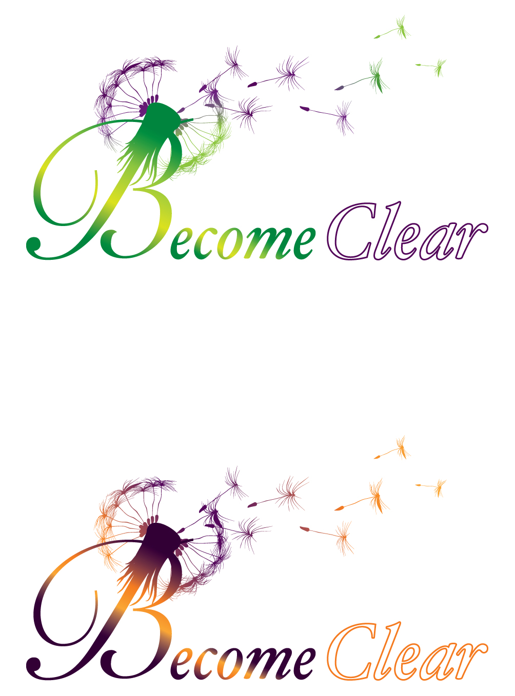
Ce client a reçu 93 designs de logo de la part de 23 designers. Il a choisi ce design de logo de logoclinic comme design gagnant.
Inscrivez-vous Trouvez des Projets de Design- Garanti
-
 A$235
A$235
-
 93 designs
-
 23 designers
Brief de Design de Logo
I need a logo for a new Australian Wholistic Consultancy that will be used on product labels, stationery, website & marketing materials. My business will utilise several modalities to assist individuals, shop owners or companies to become clear or clearer in whatever area of their life or business isnt working as well as they wish. I assist them on emotional and mental levels mostly but also the physical level in their homes, offices or bodies. I use Feng Shui, Australian Bush Flower Essences, Astrology, Office organisation, Professional writing etc, to assist clients.
The logo needs to convey some sort of progression, energy shift or change from being unclear to clear, stuck to open and free, dysfunctional to functional in some way.
It must meet the details of the brief and be bright, creative, organic and not too simplistic, utilising the suggested colours of purple/green/yellow or purple/orange/yellow.
Please note the must haves and must not haves.
I prefer logos with stylised pictorials and words, rather than just the Business name words. Many thanks.
Mises à jour
Dear Designers,
As an update to the brief for my logo please Note:
- I want to get away from traditional emblems associated with Feng Shui (such as the Yin Yang symbol as mentioned in the brief) but I also wish to get away from the bagua symbol which is quite specific to Feng Shui as my business utilises other modalities too and is not just confined to the art of placement.
- Stylised images of a flower or floral nature or person centred or house centred would work much better as they cross boundaries in my work and dont just pertain to one aspect of it. Shapes or images of things that do not resonate with my business such as whales, or abstracts do not appeal to what I am looking for.
- I do not wish to have more than 2 colours involved in the design as it will be too costly for printing and detract from the design.
- I prefer the word Clear above and to the right of the word Become so it feels the shift is up and forwards towards clarity etc.
- I am not fond of the use of black in a Logo design in thick lettring as it looks too bold, too heavy and does not give the feeling of lightness or joy or freedom as is asked for in the brief.
- I am open to receiving character logos as well as pictorial and look favorably on designs that can lend themselves in some way to animation on a website.
Many Thanks for your submissions,
Arjava
Become Clear
Dear Designers involved in submissions for the contest to design my Logo, Please note:
I have edited the original brief to reflect more accurately what I am looking for.
Please have a read when you can,
Many Thanks for your submissions.
Arjava
Become Clear
Marché(s) Cible(s)
Majority of clients may possibly be Australian females aged between 20s - late 60s, open to alternative therapies and other options to deal with illness, broken relationships, family, finance or work issues, etc. Male clients, students, couples, magazines & real estate companies are also target customers .
Secteur / Type d'entité
Business
Texte du logo
Become Clear
Styles de logo qui vous intéressent
Logo pictural
Un objet réel (texte facultatif)
Logo de figurine
Logo avec illustration ou personnage
Aspect
Chaque curseur illustre les caractéristiques de la marque client et le style que doit transmettre votre design de logo.
Élégant
Audacieux
Léger
Sérieux
Traditionnel
Moderne
Sympathique
Professionnelle
Féminin
Masculin
Coloré
Conservateur
Économique
Haut de gamme
Exigences
Doit avoir
- A design that is very unique, eye catching, lively and creative, not something corporate, flat, low key looking. Something that exemplifies a process of becoming clearer or a shift for the better. Must be two or three colour including purple and green to yellow or purple to orange to yellow and show a gradation of colour or fanning out or fading or clearing of colours in some way. Either darker on the left and getting lighter as you go right or darker at bottom and lightening as you go up. Maybe a 4th colour may be ok if it suits the design, but prefer nothing dark. Need the design to be bright with luminous or iridescent colours if possible when printed. Open to the word Clear being shown as an outline or looking clearer or lighter than the word Become. The word Clear needs to be above and to the right of the word Become to suggest movement upwards and towards more clarity or lightness. The words should not be on an angle that slopes from top left to bottom or middle right. This is a Feng Shui Logo consideration as we read from left to right so to does our energy move from left to right. I want the clients energy as they view my logo to move up and right not right and down. The design could include something that moves from dull to illuminated, muddy to clear, blurry to sharp, locked to unlocked. (Though if any of these are chosen such as blurry to sharp, it shouldnt be a whole word that is made so blurry or so clear that it is almost undiscernable and hard to make out what it is). It must resonate with the business I am in rather than have any unrelated or abstract shapes or symbols. If any quality professional clip art type image is used it needs to be flipped so that the image or energy of it leans right or flows clockwise not leans or tilts left or flows anticlockwise.
Bien d'avoir
- A logo that gives a feeling of being lighter, more joyful, happier and freer with enthusiasm and drive to move forward in whatever area of life the consultation is sort for. Something that gets across how someone may feel after they have been helped by my business and feel they have Become Clear so to speak. A design that in itself suggests becoming clearer or gives a message of hope for change for the better. A design that would lend itself well to some sort of animation on a website.
Ne doit pas comporter
- Do not include a Yin Yang or Bagua symbol as this is too common I feel. I also do not wish for any hard sharp right angles in the design as Feng Shui is about energy flowing, meandering or curving organically and naturally like in nature. Therefore if say a house is used in the design it should be a stylised soft version.