Single Page Design for RocketVideo
Vous souhaitez remporter un projet comme celui-ci ?
Ce client a reçu 8 web designs de la part de 3 designers. Il a choisi ce web design de eAnka Design comme design gagnant.
Inscrivez-vous Trouvez des Projets de Design- Garanti
-
 US$300
-
 8 designs
-
 3 designers
Brief de Web Design
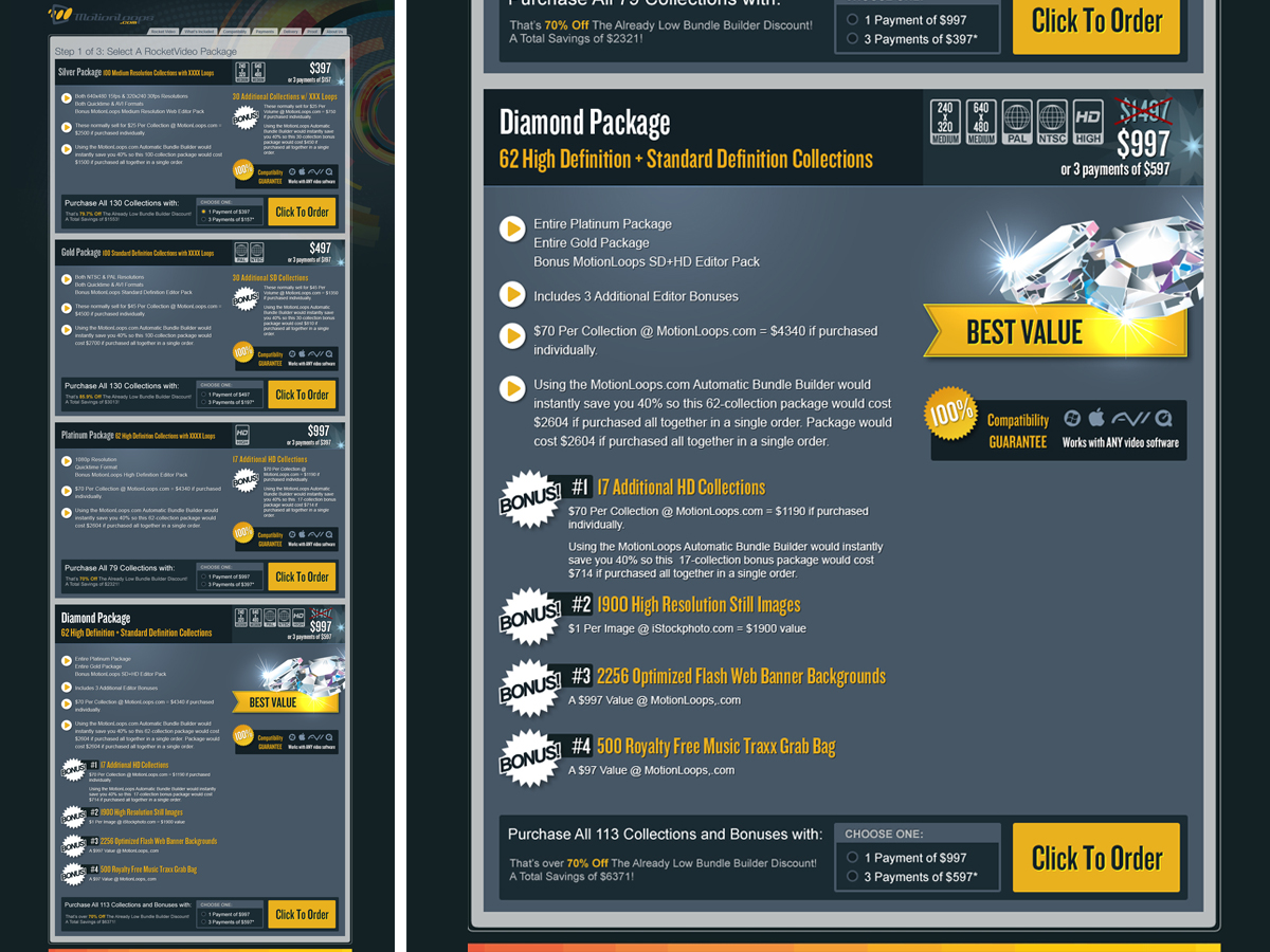
You will be designing a single uncoded page in our sales funnel on our microsite landing.motionloops.com/RocketVideo. The page you are deisgning is called the "choices page" where a customer picks a single product from the microsite using a radio button and proceeds to the next step.
Above almost all else, this page must be designed with conversion in mind. We are looking for a supplemental team very good at designing for the sale and conversion. Our current team is not very strong in making a "sales piece" with goal of causing higher RIO within our sales funnel and this is why we need you for this and possible well into the future.
I'm looking to have the attached psd mock-up design perfected by you. All the elements are in there but this is just a mock-up. I rank the mock-up as a 4 on a scale of 1-10 and we're looking for a 10. We would like it cleaner, more compact and with a "sales" feel to increase sales. This page appears during a sales process when a user us selecting the package to buy.
Your design area is within the dark gray background only. That area can be as tall as needed but must stay within the same width as the mock-up.
You may start by deleting all layers except for the background image inside the psd file if you would like a clean slate.
We need to push users towards the larger packages towards the bottom as they start to get more expensive - but also more bonuses are included so the deal gets sweeter there. You are free to redesign in any way you see fit - and you don't have to use the elements as they are. You can add or remove elements to make room for your overall design concept.
YOU ARE NOT BOUND BY ANY DESIGN ELEMENT IN THE MOCK-UP. - those are simply for reference.
I've given some notes too on how to clean up that current layout along with a few other ideas in the psd file.
You should design with text/font friendly as we must convert to html on our side.
If you would like to see the rough site where this will reside it's here: landing.motionloops.com/RocketVideo
Click on the "yes i want it button" to see the page you're designing. It will stretch down as your design requires of course but we want to try to keep it compact without cluttering. The existing radio buttons are there just a placeholder.
Our typical design firm relationship lasts many years - this page is only the very first in a very long line of design projects we have on the table. We're looking for efficiency, communication, understanding of conversion sales "looks" among the typical design requirements for a long term weekly relationship. We have a lot of potential work scheduled for the team we choose as the winner.
Mises à jour
We have uploaded a simple boxshot you may use as a placeholder for the main package and/or bonuses in your designs. We will replace with the final boxshot versions after the contest has ended. We have also uploaded a bullet point icon and rough draft of the rocketvideo logo you may integrate as you see fit.
Thank you,
Ron
Added Friday, July 08, 2011
Marché(s) Cible(s)
Professional and semi-professional video editors.
Secteur / Type d'entité
Radio
Aspect
Chaque curseur illustre les caractéristiques de la marque client et le style que doit transmettre votre design de logo.
Élégant
Audacieux
Léger
Sérieux
Traditionnel
Moderne
Sympathique
Professionnelle
Féminin
Masculin
Coloré
Conservateur
Économique
Haut de gamme
Exigences
Doit avoir
- Clean, professional and designed for the conversion. User should easily understand that it's a choice page and should draw them in to make a choice to proceed to the next step of checkout - preferably one o the more expensive packages.