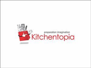
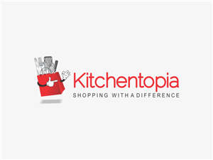
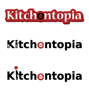
Online Kitchenware Shop revamping logo
Kitchentopia recherchait un logo design et a reçu 31 logo designs Sympathique, Audacieux, Store de 14 designers
Designs
Designers
Budget


1 - 20 de 31 Propositions de %
C'est ce que Kitchentopia recherchait dans leur logo design
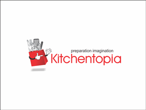
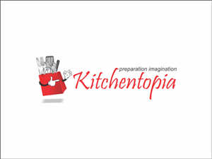
We are an online kitchenware store that also travels to markets and festivals. We need to redo our logo, as it needs to be punchier!
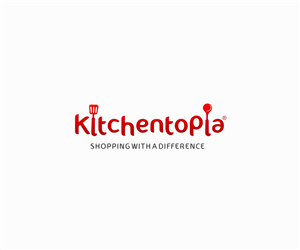
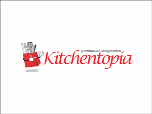
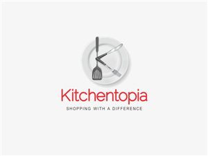
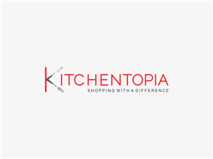
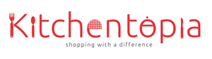
We had always envisioned a logo where one of the letters incorporated a kitchenware item.
Originally we designed one where the back of the 'K' was a knife and the other bits were a fork, but could never quite get it right.
Kitchentopia aims to give every customer the best service possible, hopefully far better than any expectations of an online store, with a personal touch.
We only sell quality products that we would use or give as gifts. If we wouldn't use it, we won't sell it!
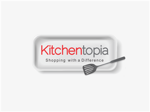
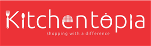
The 'shopping with a difference' slogan we have used to date tries to underline these ideals, but we are happy to lose the slogan.
We aim to have fun where ever we go.
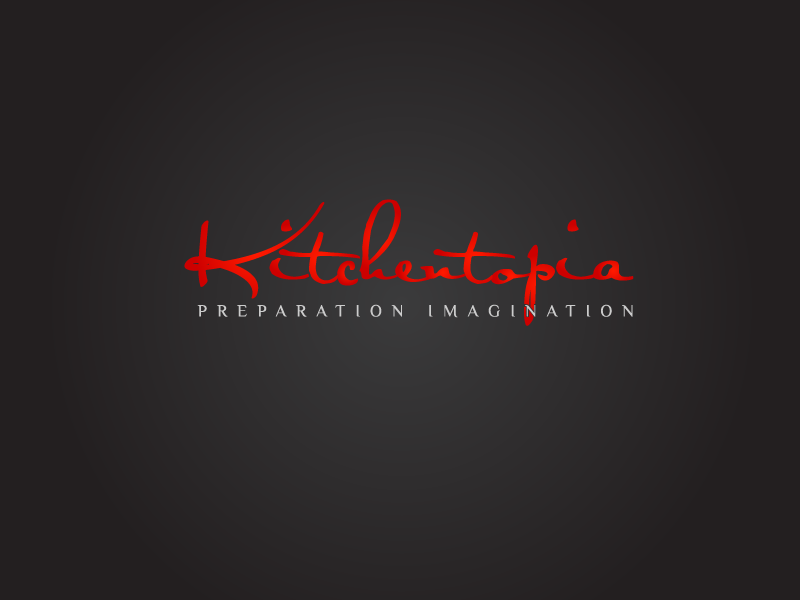
We'd like to keep the main colour of the logo red.
Voir plus