Logo Design
Motors@Work recherchait un logo design et a reçu 10 logo designs Professionnelle, Sérieux, Sustainability de 6 designers
Designs
Designers
Budget


-
 Previous page
- You're on page 1
- Page 1 of 1
-
 Next page
1 - 10 de 10 Propositions de %
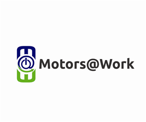
C'est ce que Motors@Work recherchait dans leur logo design
Our software helps industries and facilities save money on their electric bills by using their motors more efficiently. We have a logo that we like okay, but would love to have a more professional one.
We want to look like a modern cloud based software company.
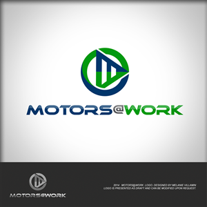
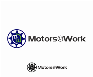
What we like about the sample:
-Three prongs in the middle represent electric plug/socket.
-Incorporates the characters 'M' '@' 'W' for Motors@Work.
-The green arrow is to convey the idea of sustainability (saving electricity). It doesn't have to be done this way, but we would like to incorporate sustainability.
-If you look at as a 3d image, it looks like a cylindrical motor with a power cord.
-We like the colors.
-Circle with single line through the middle is similar to an on/off switch.
What we don't like:
-The circular parts are jagged.
-Looks a little too much like a devil's trident and tail for my liking. Some of that may be unavoidable due to the things we lik…
Voir plus