Logo Facelift
Just the symbol. recherchait un logo design et a reçu 9 logo designs Élégant, Léger de 3 designers
Designs
Designers
Budget


-
 Previous page
- You're on page 1
- Page 1 of 1
-
 Next page
1 - 9 de 9 Propositions de %
C'est ce que Just the symbol. recherchait dans leur logo design
My company's logo is outdated and has always bothered me a bit because it is a bit unbalanced.
I would like someone to help me redesign it.
I need someone willing to offer at least 3 options:
1. Modernizing the logo while maintaining its characteristics, but making it more balanced and harmonious
2. Modernizing the logo with a differente approach.
3. A new version that explores a new path without compromising its identity.
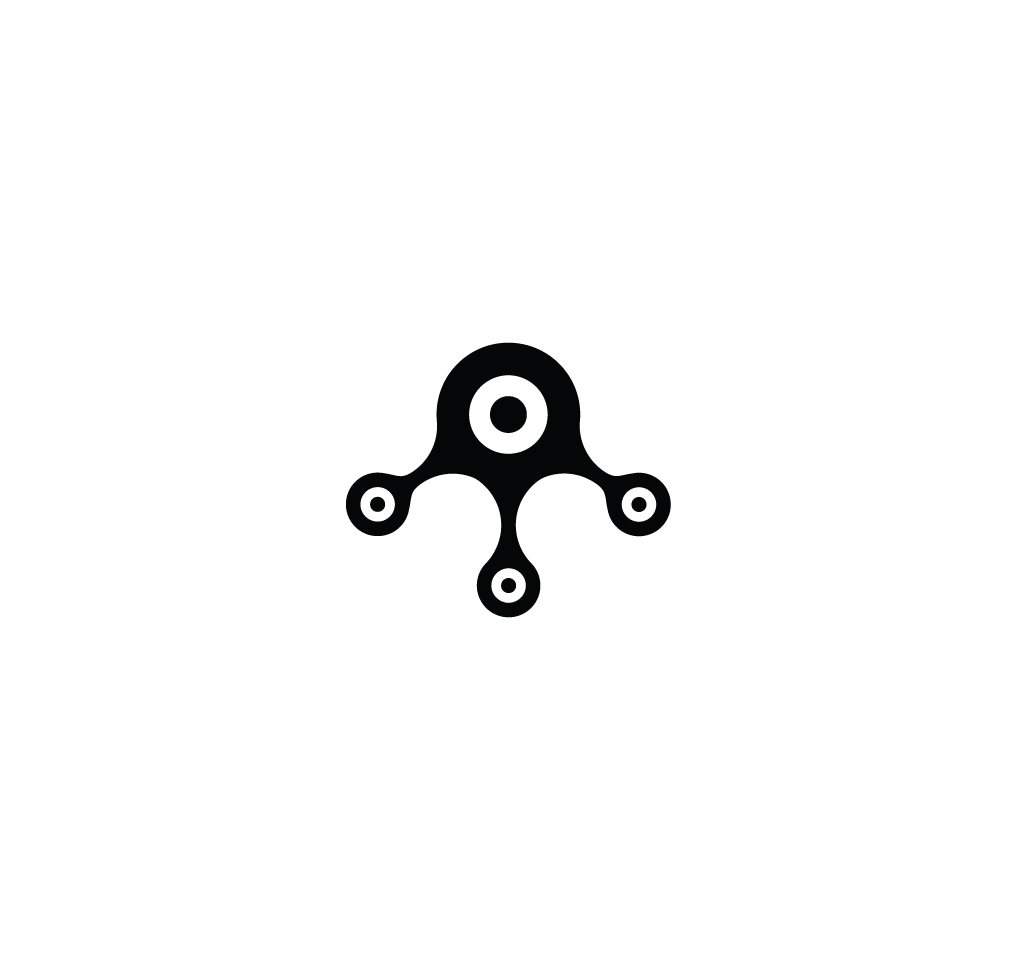
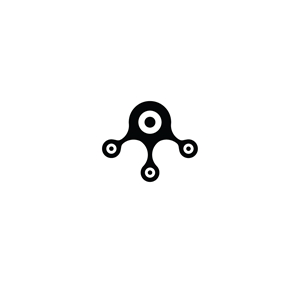
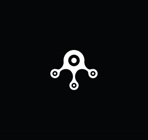
This logo was born from the idea of ??a target + connection + letter M. Some people see an octopuss, and that's ok. It maybe a possibility too.
It's really important do solve the balance of the symbol. It's strange this "legs" with different sizes.. I neet something harmonic and beautiful for my tech company.
Don't need to worry about the colors. It's ok to work with black.
Voir plus