Loudoun Pride Rebranding - LGBTQ+ Organizational Restructuring and Rebranding
Loudoun Pride recherchait un logo design et a reçu 22 logo designs Audacieux, Féminin de 10 designers
Designs
Designers
Budget


1 - 20 de 22 Propositions de %
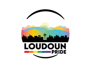
C'est ce que Loudoun Pride recherchait dans leur logo design
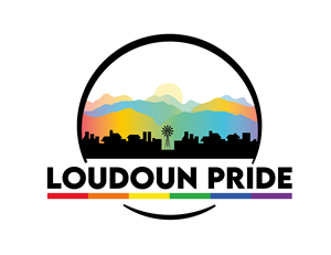
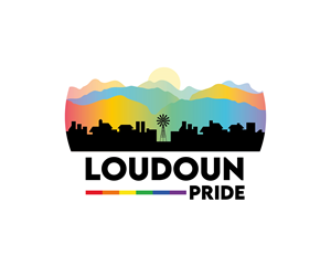
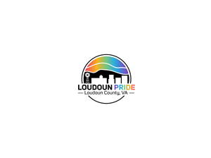
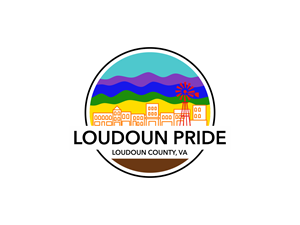
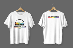
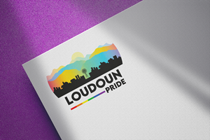
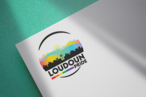
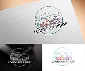
We are a local non-profit focused on LGBTQ+ advocacy. We are rebranding after 20 years in service to Loudoun Pride for better, clearer brand recognition. We want people to know we represent our local LGBTQ+ community by seeing our logo. I am looking for something that grabs the attention, is clear and colorful, and that can be re-used and re-formatted for future projects and merchandising. We want to pull elements from our existing logos, but have a fun, unique, and overall more representative logo.
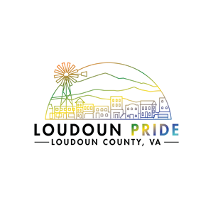
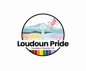
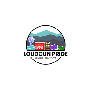
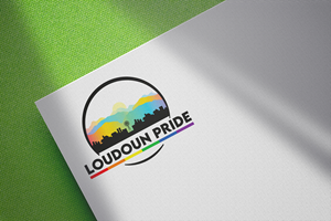
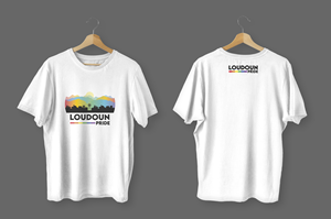
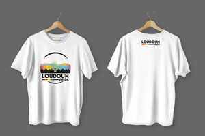
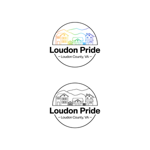
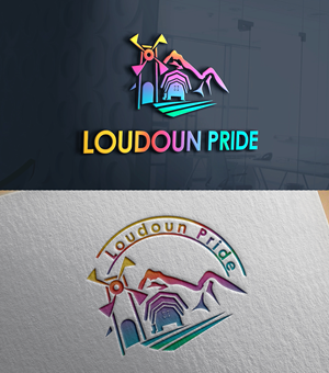
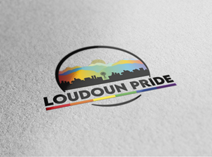
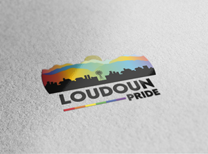
The logo I am imagining is essentially a circular logo (similar to a destination branding), white background, with a broken circle on the outside, with watercolor mountains (old, rounded, Appalachian style - not pointed Rockies style), and a long- small-town streetscape at the base. (see Loudoun Pride Festival logo for streetscape concept). Should incorporate the progress pride flag colors (see Equality Loudoun logo) into the color scheme. And then in black text, font like a sligh…
Voir plus