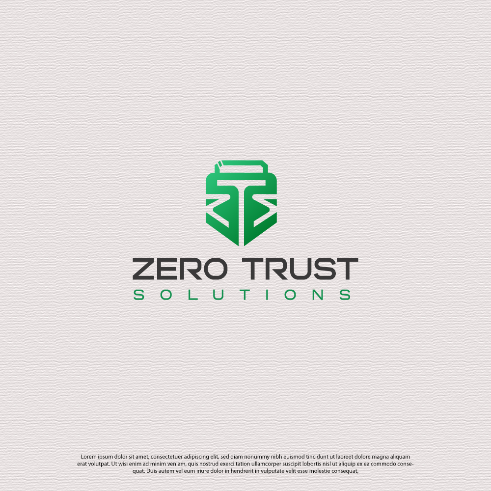
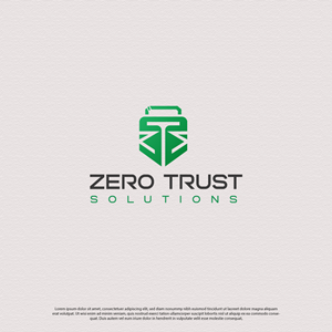
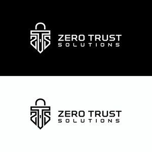
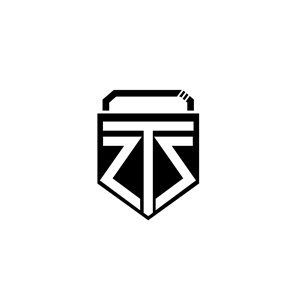
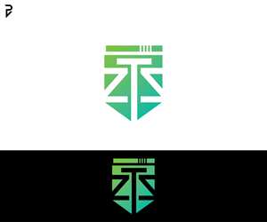
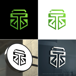
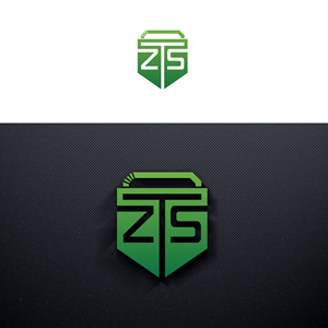
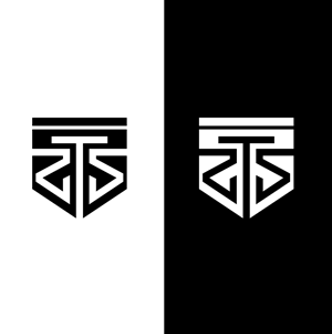
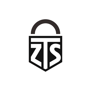
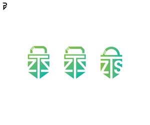
ZTS - Shield & Padlock based Logo - See brief and inspiration
Z T S recherchait un logo design et a reçu 100 logo designs Moderne, Professionnelle de 39 designers
Designs
Designers
Budget


1 - 20 de 100 Propositions de %
C'est ce que Z T S recherchait dans leur logo design
Need a logo made for upcoming consulting work I'm doing, I saw your logo design for "IRGI JAPAN (https://www.designcrowd.com/design/17471849)" and really liked it. I'm hoping to have something similar based on the idea of:
Z T S being the letters, potentially more symmetrical than asymmetrical (will trust your design intuition here). Whatever looks better though, as long as it's clear it's an S without the knowledge of it supposed to being an S. Don't want the letters taking up most of the logo though, I do want there to be some weight the shape of the shield. Maybe upto 70% or the real estate is the letters at most? The letters should also be delivered and visible through the use of negative space much like the inspiration
The shape is great, very shield like (commonly used in security iconography) but the top line could potentially stick out a tiny bit like a squared padlock latch, with the stripes indicating where the latch would pop out of the lock maybe?