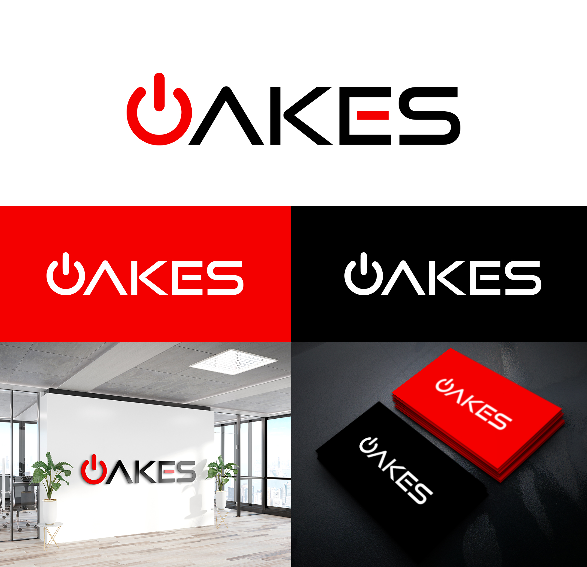
Oakes Electronics Logo
OAKES recherchait un logo design et a reçu 54 logo designs Audacieux, Sérieux, Electronics de 31 designers
54
Designs
31
Designers
$120
Budget


1 - 20 de 54 Propositions de %
C'est ce que OAKES recherchait dans leur logo design
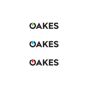
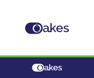
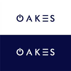
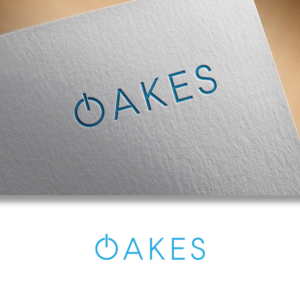
The logo is for an electronics company. The logo is the word “OAKES” in upper case, color black. The first letter “O” is to appear like a power-on icon in the color green or blue or red. For example, the black “O” could be broken/open at the top with a centered vertical line in green, blue or red so the “O” looks like a power button. The logo is to look modern, crisp, clean & simple. Voir plus