P2P Logo Design Project
Patient to Provider recherchait un logo design et a reçu 32 logo designs Élégant, Sérieux, Communication de 15 designers
Designs
Designers
Budget


1 - 20 de 32 Propositions de %
C'est ce que Patient to Provider recherchait dans leur logo design
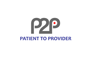
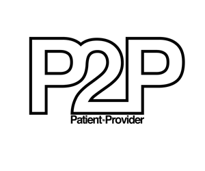
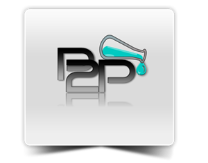
The P2P is an assessment instrument that is administered to patients in a medical office. The logo will be visible online while the patient answers the questions and will appear on a printed report for the doctor's office. So, it should look nice online and print well in color or black and white.
The main purpose of the instrument is to provide patients an opportunity to communicate to their doctors their attitudes, preferences and opinions about their medical care, and the communication style they prefer from their doctors. Thus, P2P stands for “Patient to Provider.”
Since the atmosphere is a medical setting, we are looking for a clean, professional, simple logo that also incorporates the concept of communication and connectedness.
We would like the P2P letters/number to be "connected" and "interacting"
Voir plus