Upgrade/"Tweak" My Landing Page
Vous souhaitez remporter un projet comme celui-ci ?
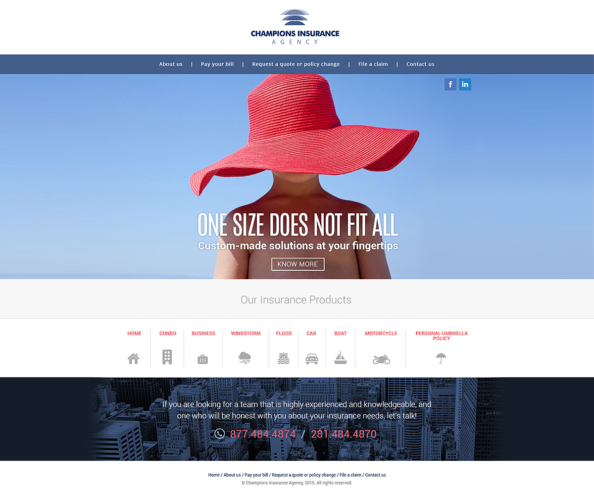
Ce client a reçu 15 designs de page d'accueil de la part de 6 designers. Il a choisi ce design de page d'accueil de arunk comme design gagnant.
Inscrivez-vous Trouvez des Projets de Design-
 US$250
-
 15 designs
-
 6 designers
Brief de Design de Page d'Accueil
We need to "tweak" our current landing page. I'm a perfectionist and something seems "off". Things I LOVE about our current page: I love our message that "ONE SIZE DOES NOT FIT ALL", as well as the photo used (boy wearing an oversized hat). I also like the fact that the photo is in full screen mode- I like this look.
THINGS I DON'T Like: The font & location of our message "ONE SIZE DOES NOT FIT ALL" - just seems "off". I'm also concerned about the placement of our menu being on the left hand side of the screen. Not sure if this is ideal. Also, my product types are listed on the left hand side of the screen in the menu section. My audience seems to think these are links when in fact they are just examples of the products I sell. How can I position these so the audience knows it's for informational purposes only.
Help!! I want my landing page to be PERFECT.