Jcademy Distance Learning Website
Vous souhaitez remporter un projet comme celui-ci ?
Ce client a reçu 75 web designs de la part de 10 designers. Il a choisi ce web design de CreativeMoth comme design gagnant.
Inscrivez-vous Trouvez des Projets de Design- Garanti
-
 US$300
-
 75 designs
-
 10 designers
Brief de Web Design
Jcademy provide e-learning and mixed learning solutions for individuals, colleges, organisations and B2B.
We need a modern, light and flat website design for Jcademy. We want to to see the designer incorporate user experience(UX) design elements into the AI or PSD mockups. We would like to see designs that use pastel colors that compliment yellow and black of our logo.
We want our E-learning experience to accelerate learning and for the interface to be user friendly and intuitive. We want the designs to focus on quick access to course information, course reviews, learning progress and study advice. Quick and intuitive access to all content for our clients is one of our top priorities.
We would like designs for the following project 3 pages:
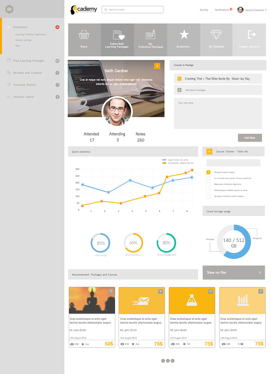
1. Learner homepage dashboard (see attached screenshot).
On this page the Learners need to:
- Login
- Have quick access to Packages and Courses.
- See other recommended courses (Below Packages and Courses)
- Possibly a left hand side column/menu with thumbnail icons (See docebo learner dashboard screenshot)
2. Homepage
See current sample
http://www.jcademy.com
We would like the designer to focus on creating a customized banner to enhance the home page.
3. Primary Landing/Marketing page
This page is geared towards customer acquisition with the focal point being the top banner (video or HD image).
And Course Preview content below.
See reference
http://jcademy.com/subscriptionPlans/marketing/MTc%3D/Mjc4Nw%3D%3D/Cracking%20Thai%20%2B%20Thai%20Bites%20Bundle%20by%20Stuart%20Jay%20Raj
Other site we like:
- https://www.udemy.com (We like the home page and top bar on courses page)
- http://www.academyofmine.com
- http://teamtreehouse.com (think this site looks great, love the lower graphics on the homepage)
Mises à jour
Hello,
Thank you for taking the time to contribute to this web design competition. We would just like to point out a few things:
1. Please try to make the color palette similar to the colors used in the screenshot that we just uploaded ('possible color palette).
2. Please make the designs specific to each page: THE LEARNER HOMEPAGE, HOME PAGE, and the MARKETING LANDING PAGE.
We are very happy with the high quality of designs so far,
Cheers,
Tom Oc
SR-Design
Added Monday, February 09, 2015
Also,
Please avoid using dark/bold elements in the designs. The ONLY elements that we want to be dark are the logo and the footer.
Any questions please ask,
Cheers,
Tom Oc
Sr-Design
Added Monday, February 09, 2015
Hello,
Based on the round of feedback we just gave it would be great if you could complete further design changes by tomorrow, as we are pushed for time.
Thank you,
Tom Oc
SR-Design
Added Tuesday, February 10, 2015
Secteur / Type d'entité
Marketing
Styles de police à utiliser
Aspect
Chaque curseur illustre les caractéristiques de la marque client et le style que doit transmettre votre design de logo.