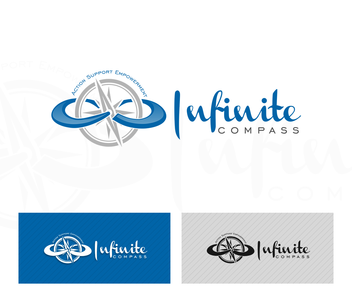
'Infinite Compass' Life Coaching needs a Logo Design

Vous souhaitez remporter un projet comme celui-ci ?
Ce client a reçu 41 designs de logo de la part de 13 designers. Il a choisi ce design de logo de damian comme design gagnant.
Inscrivez-vous Trouvez des Projets de DesignBrief de Design de Logo
We need a logo design for my new coaching business "Infinite Compass". It is a hands on coaching service designed to inspire, empower and support people with diabetes to meet their life and health goals. I do not want this logo to look anything medical model related. (Think homeopathy not pharmaceutical design) Rather, the clients are accessing their inner wisdom through support of their coach to live their best life. We want it to be a warm, calming logo, showing direction and internal strength. We want the colours to blend in a "historical" feel. Asymmetrical imperfection is welcome!
Now to discuss the Uploaded Reference Files:
1. The first image is a preliminary attempt at the logo. This is unfortunately not what we are looking for. We found the logo to be clean but cold, it has a 'Bayer and Bayer' vibe that isn't aligned with our business ideals. However, we were pleased with the literal interpretation of our company name, the compass and infinity symbol, but once again felt that it was too "big business".
2. The Second image is a reference font. Don't feel tied to use it, or one like it. It is just a friendly design which we like, that we hope can inspire you. Legibility and memorability are important to us, so make sure it looks right with your vision!
3. The Third Image is an Asian Brushed infinity symbol. We like this because it is less imposing than the original design and it adds a fluidity to the infinite cycle, which we believe to be ever changing and malleable. This image is simply meant to inspire form and shape.
4. The Forth Image is a stock of a compass we found online. We liked the leaves on the rim of the compass and thought that it could add to the fluid nature of the logo. Although we wouldn't want it to be as vectored and shiny. We are looking for something more sophisticated.
5. The fifth and final image is a hand holding a leaf. We liked this design because of the 'implied structure' it gives to the logo. We hope that you can incorporate this into the design.
That all being said, you are the creative powerhouse here. So please take these references with a grain of salt, and do what feels right to you. We want it to look natural, yet be striking enough to be memorable.
Colouring:
We are interested in Slate Gray, Earthy colours, Green and Blue, and (if it works) Pink or Magenta used as highlights.
That about wraps everything up. Good luck with your designs, we understand the rockiness of the creative process and are more than happy to keep open channels of communication.
Secteur / Type d'entité
Pharmaceutical
Texte du logo
Infinite Compass