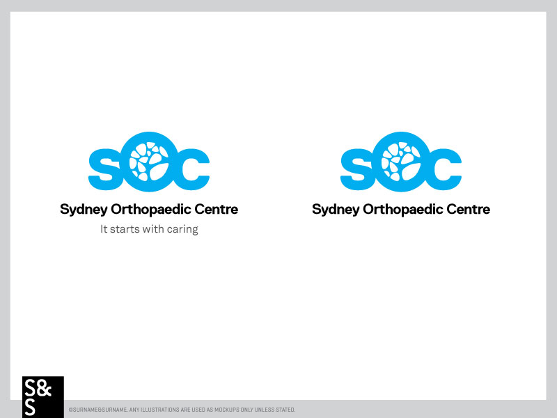
Sydney Orthopaedic Centre
Vous souhaitez remporter un projet comme celui-ci ?
Ce client a reçu 97 designs de logo de la part de 36 designers. Il a choisi ce design de logo de surname and surname comme design gagnant.
Inscrivez-vous Trouvez des Projets de Design- Garanti
-
 A$320
A$320
-
 97 designs
-
 36 designers
Brief de Design de Logo
We need a logo for an Orthopaedic Group. We are a boutique group of Surgeons who specialise in various regions of the body ie: Hips, knees, ankles, shoulders and elbows and wrists. We truly do CARE about every patient and their outcome. We are experienced, modern and innovative surgeons. We want our logo to be fresh, simple and clever. The colours; silver, black, charcoal, white and a bright graduated sophisticated blue which is uplifting and clean.
Orthopaedics is a profession whereby we fix peoples bone fractures, repair ligaments and muscles with various operations.
The practice DOES NOT have a spine surgeon so please NO logos with reference to the spine.
We want a unique logo with the tag line ''it starts with caring''
Mises à jour
Project Deadline Extended
Reason: Dear designers, we are still deciding on the logo and some group members have been away and we need their input. Hence we need to extend the deadline. Many thanks for your designs so far. Hoping to have a design winner soon.
Your patience is appreciated,
Regards
CHL
Added Monday, January 26, 2015
Thank you everyone for your designs so far. I have made a few changes to the project request should you like to re-visit that. The deadline has been extended as we are still awaiting feedback from the other orthopods. Please continue to send new designs. Hoping to have this resolved well before the new deadline.
Many Thanks
CHL
Added Monday, January 26, 2015
Dear all, I am about to make a decision regarding the winner for the logo competition. I just want to thank you all for your designs and the thought you put into them. All of them were of a very high quality which made the decision making process very difficult. thank you once again for your energy and time. CHL
Added Tuesday, February 03, 2015
Marché(s) Cible(s)
The Target Market are the general public who have injuries to their bones, muscles and or ligaments. Some patients may also need Joint replacement surgery ie: Hips Knees and others may be sports people who need Hip, knee or ankle reconstructions We also want our logo to appeal to referring GPs so they have a good understanding of how their patients will be looked after. The surgeries performed address pathology of the Hip, Knee, Ankle, Shoulder and elbow and wrists.
Secteur / Type d'entité
Boutique
Texte du logo
Sydney Orthopaedic Center "it starts with caring"
Styles de logo qui vous intéressent
Logo d'Enseigne
Logo contenu dans une forme
Logo pictural
Un objet réel (texte facultatif)
Logo abstrait
Conceptuel / symbolique (texte facultatif)
Logo de figurine
Logo avec illustration ou personnage
Logo mot symbole
Logo (texte seulement)
Logo de Lettermark
Acronyme ou logo texte (texte seulement)
Styles de police à utiliser
Couleurs
Couleurs choisies par le client et à utiliser dans le design de logo:
Aspect
Chaque curseur illustre les caractéristiques de la marque client et le style que doit transmettre votre design de logo.
Élégant
Audacieux
Léger
Sérieux
Traditionnel
Moderne
Sympathique
Professionnelle
Féminin
Masculin
Coloré
Conservateur
Économique
Haut de gamme
Exigences
Doit avoir
- The logo should have its Slogan nearby: "It starts with caring"
The inspirational pictures below are ''spongy bone'' which is in the middle of your bones.
Bien d'avoir
- clean, innovative, professional
Font options for the tagline
Ne doit pas comporter
- Should not have any reference to the spine
Should not look like every other orthopaedic/ sports logo out there...
_brief134748.png?AWSAccessKeyId=ASIARQT47ZIUXTNSLOQ2&Expires=1782162174&response-content-disposition=attachment%3Bfilename%3D%22untitled%20%286%29%20Tuesday%2C%2013%20January%202015%2006_47_48.png%22&x-amz-security-token=IQoJb3JpZ2luX2VjECkaCXVzLWVhc3QtMSJGMEQCIBD2UrrDrbDrh%2FGnLBhS7kGMMfQ11B3qWJuKBZCgyITXAiA0hPtKzA5xaJ7pCP9VIuPMaIxYreYASUeabWxGogo3iyr0Awjy%2F%2F%2F%2F%2F%2F%2F%2F%2F%2F8BEAAaDDEwNDQxNTA4NzE0NSIM3nLLMNE5cW4pPNLcKsgDtbbTc6QyJwMKIKOOltTa6a%2F5aQz270rtxp4SrI%2BZs6n2XgFV2nQe8BxFJDtC2fMD7Vk%2B0W3Z1VOW1dVGCc8F9DoE3eJsPsKY%2BTBujHszUBWLEfPFEv83Qaj%2FaZWMLW%2F9g53cWgCPGEbHNz8kLuWLnQSlNS5%2BTmLwV9Afx7Nv6ydM9uErh313RncSUaBgYahfxr3WG4KjIzUSr6EhhsaCv4GVdbQrhb7w85mvGSWJ48FBn4OLylDp5kFCTivwiRNlcELp1BBII2FE0R9yDILvHjsAbQOe68mdnM9MX9NVHajBWvu1m%2FzWXJ5IcuoZ4qSyLBlRcpR1HroCHzM9nZckMVuWgb9t%2B5noS0qv5x5VHtrlV7kJos6P5EZl7KtEUGBMWzdxbBmSv5GBEIpobpBuUMNeF6mStpkWf0u0%2F5pcj%2BzeTGD0PQbg0j38NpbImIdzc6KO989AzHVvTuw8TTj0qxgLqrAslSKbuvATb%2FggPnVtuFq%2BUW0UsQHgs8jOuHMdBSGcyVbPPJJ43rpmvhJTxyLP2drED3ozwK%2FzT%2FZYD8JZ3DHio3ugJwZYwkOcGe2EhtQp1fJAJel9Hsxvk8DonAcKxe4gJ3WSMPaq4NEGOqYBdqaREPefCkBVE2znYVBAqs7b6KuDW%2BjsQkkXt2YwUhZnwXey1Jn9IT2rN36G50DwrPAA98cZlzpPcv34W9z1%2FPkaOQcup1z1R7rRYDpYumOZ20JzqJAA%2F2%2FMxPWDTUJc1xSonD3Vstez0pGiS1tm6UJ9VccOUkifazszZWJM5w1Hr2v5CxrAeL8cD%2Bi6pvwhbpMPMGa8Ccx4JL9wMMTwPkhhu%2BTJ6Q%3D%3D&Signature=yaDnicsB3XGCVYdrFc%2FC2jDqJDY%3D)