Apartment Listing Website Needs a Logo Design
Vous souhaitez remporter un projet comme celui-ci ?
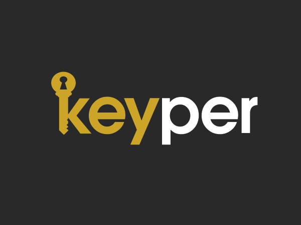
Ce client a reçu 526 designs de logo de la part de 81 designers. Il a choisi ce design de logo de Grace A comme design gagnant.
Inscrivez-vous Trouvez des Projets de Design- Garanti
-
 US$160
-
 526 designs
-
 81 designers
Brief de Design de Logo
Please see the attached image. We drew that to show exactly what we want and would like the logo to follow that idea.
- All lowercase letters
- The letter "k" is the key
- The hole in the key and the letter "p" is the same size
- Clean looking and simple
- Please feel free to fiddle with different colors and fonts
Mises à jour
We are also looking for designs now that will just say "Keyper" instead of the full name ("Find a Keyper"). Added Sunday, February 08, 2015
Project Deadline Extended Reason: We are extending the deadline because at first we said the logo should state "Find a Keyper" but now we are also accepting just "Keyper" because it may look/sound better. Sorry for the confusion. Added Tuesday, February 10, 2015
Can we see some designs using only the word "Keyper" and maybe an orange and blue color scheme? No particular shades of those colors, so feel free to be as creative as you like! Added Saturday, February 14, 2015
Everyone please see the updated design brief for more instructions. Thank you! Added Sunday, February 15, 2015
Marché(s) Cible(s)
Renters: students, young families, working professionals, all people who rent.
Secteur / Type d'entité
Apartment
Texte du logo
Keyper
Styles de logo qui vous intéressent
Logo mot symbole
Logo (texte seulement)
Styles de police à utiliser
Autres polices appréciées:
- Any bold/modern/inviting looking font is fine.
Aspect
Chaque curseur illustre les caractéristiques de la marque client et le style que doit transmettre votre design de logo.
Élégant
Audacieux
Léger
Sérieux
Traditionnel
Moderne
Sympathique
Professionnelle
Féminin
Masculin
Coloré
Conservateur
Économique
Haut de gamme
Exigences
Doit avoir
- Please see the attached image. We drew that to show exactly what we want and would like the logo to follow that idea.
- - All lowercase letters
- - The letter "k" is the key
- - The hole in the key and the letter "p" is the same size
- - Clean looking and simple
- - Please feel free to fiddle with different colors and fonts
Bien d'avoir
- Please see the attached image. We drew that to show exactly what we want and would like the logo to follow that idea.
- - All lowercase letters
- - The letter "k" is the key
- - The hole in the key and the letter "p" is the same size
- - Clean looking and simple
- - Please feel free to fiddle with different colors and fonts
Ne doit pas comporter
- The project should not be a generic logo that any real estate or real estate advertising company would have (such as: the company name with a roof over top of it).