

 Rafraîchir
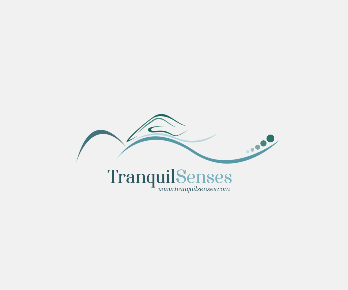
Tranquil Senses Logo Redesign
Vous souhaitez remporter un projet comme celui-ci ?
Ce client a reçu 62 designs graphiques de la part de 21 designers. Il a choisi ce design graphique de booosh design comme design gagnant.
Inscrivez-vous Trouvez des Projets de Design
- Garanti
-
 £145
£145
-
 62 designs
-
 21 designers
Brief de Design Graphique
Due to the client extending her range of services she requires her logo to be redesigned in a more generic manner. Prior to recent qualifications she was only performing Reflexology and hence the 'foot' for the logo. Now she has gained a Massage qualification the logo needs to depict those treatments as-well. Have attached the current logo but feel that it should sit more horizontal to take into account current design trends for sitting well at top of a website and on business cards etc. Her website may be viewed at http://www.tranquilsenses.co.uk to show colors that we have been working with. Perhaps a silhouette with a hand over the body ? The design must also be gender neutral.
An example of the type of feel looking for http://www.shutterstock.com/pic-153748382/stock-vector-massage-sign-vector-illustration.html

Mises à jour
While trying to sleep thought through a design idea myself with a silhouette of a person laying down with a hand floating over the outline. The design should be gender neutral though.
Added Friday, January 02, 2015
Here is some inspiration of where my thought process has been going.
http://www.shutterstock.com/pic-153748382/stock-vector-massage-sign-vector-illustration.html
Added Friday, January 02, 2015
The winning design *must* be delivered with all graphical formats suitable for web and illustration eg. AI, SVG, PNG. The design needs to be fully scalable for media reproduction. Bigger is better.
Added Saturday, January 03, 2015
It is apparent that some designers are making the text "Tranquil Senses" to be part of the logo. This should not be the case and the design should be able to work without. The rationale is that the design could be embroided on a shirt/blouse with the website address underneath.
Added Tuesday, January 06, 2015
Marché(s) Cible(s)
Adults aged 18 to 60. Demographic of sporting, professional and retired people.
Secteur / Type d'entité
Business
Styles de police à utiliser

Couleurs
Couleurs choisies par le client et à utiliser dans le design de logo:
Aspect
Chaque curseur illustre les caractéristiques de la marque client et le style que doit transmettre votre design de logo.
