Logo Design for indie rock band
Gagnant
Vous souhaitez remporter un projet comme celui-ci ?
Ce client a reçu 38 designs de logo de la part de 16 designers. Il a choisi ce design de logo de MrBranding comme design gagnant.
Inscrivez-vous Trouvez des Projets de Design-
 US$400
-
 38 designs
-
 16 designers
Brief de Design de Logo
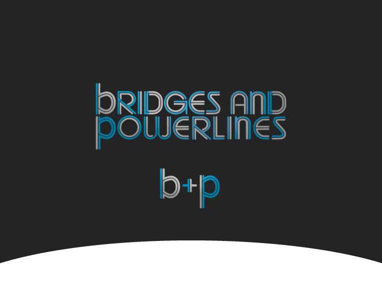
We need a logo for a brooklyn indie rock band called bridges and powerlines. The logo probably should have different colors for each letter, an array of grays, browns and a few more hopeful colors (some faded blues) and should be all lowercase.
would like a wordmark logo using the band name and a separate similar logo with the acronym b & p
the brand image / personality is: honest, hopeful, slightly quirky, somewhat nostalgic
Marché(s) Cible(s)
ages 13-40, indie rock crowd (a bit hipster-y)
Texte du logo
bridges and powerlines
Styles de logo qui vous intéressent
Logo mot symbole
Logo (texte seulement)
Logo de Lettermark
Acronyme ou logo texte (texte seulement)
Aspect
Chaque curseur illustre les caractéristiques de la marque client et le style que doit transmettre votre design de logo.
Élégant
Audacieux
Léger
Sérieux
Traditionnel
Moderne
Sympathique
Professionnelle
Féminin
Masculin
Coloré
Conservateur
Économique
Haut de gamme
Exigences
Doit avoir
- convey the desired brand image: hopeful, honest, slightly quirky, nostalgic.
use the attached image, really like that design, ideally extremely similar.
the logo must have two things:
a text logo with "bridges and powerlines"
and an acronym logo with "b&p"
the text logo likely should be on two lines aka:
bridges and
powerlines
but not so sure about that.
can check out the music and art (to get a sense) at:
bridgesandpowerlines.com
soundcloud.com/bridgesandpowerlinesband
Fichiers
JPG
photo-4 Tuesday, 05 February 2013 12:40:57
mardi 5 février 2013
Paiements
1e place
US$360
Primes de participation x 2
US$20