Education Website Re-Design for Non-Profit
Vous souhaitez remporter un projet comme celui-ci ?
Ce client a reçu 17 web designs de la part de 3 designers. Il a choisi ce web design de pb comme design gagnant.
Inscrivez-vous Trouvez des Projets de Design-
 US$560
-
 17 designs
-
 3 designers
Brief de Web Design
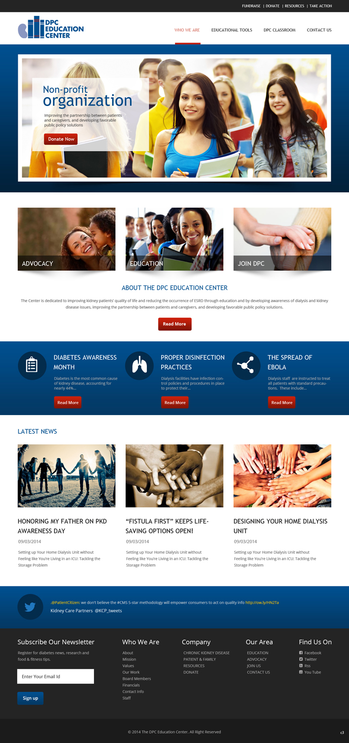
We are looking for a re-design of our education website, the DPC Education center. The Education Center is intended to be the "go to" resource for interactive classrooms and resources on chronic kidney disease and dialysis for patients, family members and interested parties. We are looking for a re-design on the home page and then design the basic pages that host the content on the site. Also, the classroom pages could use a revamp with a Left-Right Menus (nav on left vs. right)
Current website: www.dpcedcenter.org
Example Basic Page: http://dpcedcenter.org/diabetes-awareness-month
Classroom Page: http://dpcedcenter.org/classroom/home-hemodialysis
Mises à jour
Project Deadline Extended
Reason: Need more time to decide on current submissions.
Added Monday, February 09, 2015
Marché(s) Cible(s)
Current patients, family members, healthcare professionals
Secteur / Type d'entité
Education
Code
Codé - Design et Code demandé
Nombre de Pages Demandé
3 page
Styles de police à utiliser
Couleurs
Couleurs choisies par le client et à utiliser dans le design de logo:
Aspect
Chaque curseur illustre les caractéristiques de la marque client et le style que doit transmettre votre design de logo.
Élégant
Audacieux
Léger
Sérieux
Traditionnel
Moderne
Sympathique
Professionnelle
Féminin
Masculin
Coloré
Conservateur
Économique
Haut de gamme
Exigences
Doit avoir
- The website is hosted using Drupal 7 and will likely be upgraded to Drupal 8 so as much compatibility with Drupal as possible would be nice. Also we would like it to be a responsive design with two breakpoints for phone/tablet and then tablet/desktop views. Please keep the branding colors and fonts the same as found in the attached draft style guide.
- I'm attaching a screen shot of the American Diabetes Association website. We like the layout and cleanliness of the information presented on their homepage and then their subsequent education pages. (url:http://www.diabetes.org/?loc=bb)
Bien d'avoir
- I would like to see a clean, semi-modern design. I currently HATE the narrow fixed width design we have with the puzzle piece navigation objects
- Education Topics: Nutrition, Pediatric Kidney Disease, Diabetes, Bone and Mineral Disease, Treatment Options, Heart Disease, Mental Health, Chronic Kidney Disease, CKD Prevention, Emergency Preparedness, Anemia Management and Paying for Dialysis (Like bottom of American Diabetes Association)
Ne doit pas comporter
- Narrow fixed width design, white background around text makes it look disjointed and dated, no "educational tools" menu/subpage focus, shouldn't prioritize "advocacy" portion, it should be included but at the bottom. Education topics and tools need to be prioritized.