Oral Health Packaging Design
Vous souhaitez remporter un projet comme celui-ci ?
Ce client a reçu 16 designs emballage de la part de 6 designers. Il a choisi ce design emballage de #CPG# comme design gagnant.
Inscrivez-vous Trouvez des Projets de Design- Garanti
-
 A$360
A$360
-
 16 designs
-
 6 designers
Brief de Design Emballage
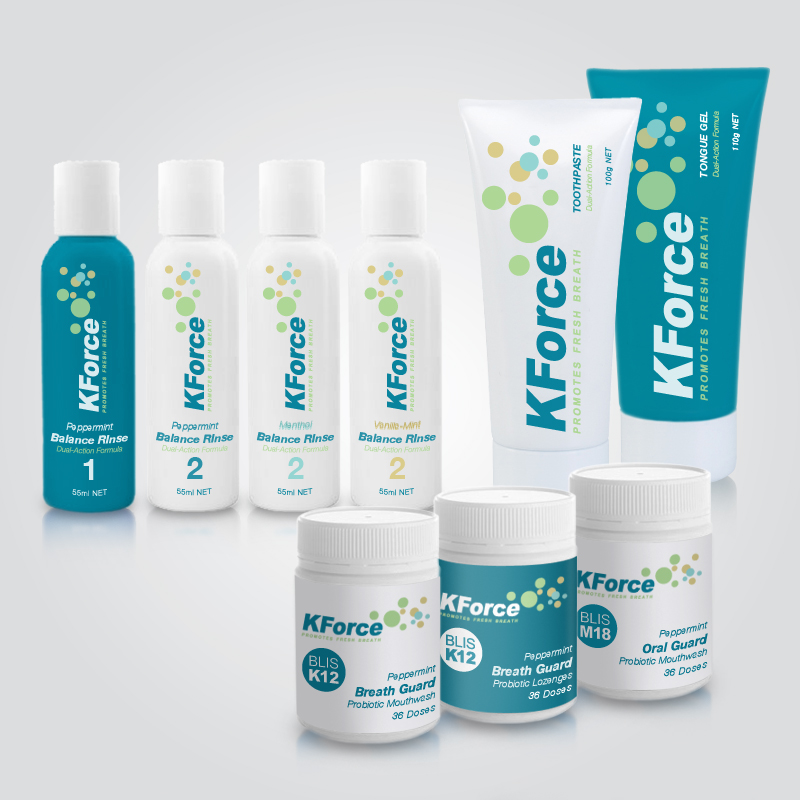
I need to redesign the products in our KFORCE Range of toothpastes and mouthwash.
1. KFORCE Toothpaste (http://www.badbreath.com.au/aus/balance-toothpaste.html)
2. KFORCE Tongue Gel (http://www.badbreath.com.au/aus/kforce-gel.html)
3. KFORCE (with BLIS K12) "breathguard" (http://www.badbreath.com.au/aus/kforce-powder.html)
4. KFORCE (with BLIS M18 "oralguard" (New Product)
5. KFORCE Balance Rinse (two bottles mixed together) (http://www.badbreath.com.au/aus/balance-rinse.html)
I need all the products to look like a family.
TOOTHPASTE & MOUTHWASH
The toothpaste and tongue gel are used together. So we are dumping the breathguard and balance names and rebranding under just KForce. Customer feedback is that they are embarrased to put these products in their bathroom in case someone sees them. So we are looking for a clean, corporate and clinical look that emphasises mouth health and maximising fresh breath.
The K12 and M18 can be used together but not necessary. These are our special blend of probiotics. By law we can only say that they treat bad breath, we are not allowed to talk about other health benefits. So I thought that images (maybe as a watermark behind the text might help). So looking to get a graphival look to these labels for the probiotics. Disctinction is that K12 is for fresh breath and M18 is to prevent tooth decay and Oral health
Balance Rinse comes in three strengths. It is two liquides mixed together. This rinse is used twice a week to knock down the bacteria to help the probitocis work
Initial stage is to get the family feel.
Next is the K12 and M18 labels
Next is the Toothpaste
Next is the Balance Rinse
Next is the tongue gel
Marché(s) Cible(s)
People with bad breath or looking for maximum mouth health
Secteur / Type d'entité
Health
Aspect
Chaque curseur illustre les caractéristiques de la marque client et le style que doit transmettre votre design de logo.
Élégant
Audacieux
Léger
Sérieux
Traditionnel
Moderne
Sympathique
Professionnelle
Féminin
Masculin
Coloré
Conservateur
Économique
Haut de gamme
Exigences
Doit avoir
- Corporate, clinical, neat and tidy should show confidence
Dropping the Breathguard and Balance labels. Putting everything under KFORCE brand. However probiotics can have "breathguard" at bottom of label for K12 and "oralguard" at bottom of label for M18
Bien d'avoir
- I have uploaded two brochures of K12 and M18. I like the circle design around the K12 and the M18and I also like the colouring.
Ne doit pas comporter
- no medical claims