Logo design for engineering company
Vous souhaitez remporter un projet comme celui-ci ?
Ce client a reçu 35 designs de logo de la part de 17 designers. Il a choisi ce design de logo de Kris Kendrick comme design gagnant.
Inscrivez-vous Trouvez des Projets de Design- Garanti
-
 £270
£270
-
 35 designs
-
 17 designers
Brief de Design de Logo
Easicut Precision Grinding Company Ltd. is an engineering company that specialises in both surface and angle grinding. Grinding is the process by which metal is removed from an object by very fast moving abrasive stones which move round in a circular motion. Most of our work involves re-sharpening blades and grinding large pieces of metal to very fine tolerances We sharpen blades that are in use in all different types of industries which include metal, plastic &, recycling, wood and paper industry. We are able to remove the metal up to very fine tolerances ( i.e. we can accurately remove metal to about 1 thou in thickness this is about ½ the thickness of a piece of paper)
Marché(s) Cible(s)
Our customers are all business customers as opposed to the general public. We are a long established family business and have been established since 1952. I am the fourth generation of the family business. As mentioned previously we provide this service to all different types of industries which include metal, plastic & recycling, wood and paper industry.
Secteur / Type d'entité
Engineering
Texte du logo
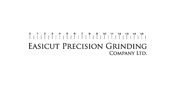
Easicut Precision Grinding Company Ltd.
Exigences
Doit avoir
We are looking for a logo to replace our current logo, our current logo is simply our company name alongside a picture of our industrial warehouse. Whilst this represents our longevity I do not feel it represents the other characteristics of my business that I want to show.
Logo must be able to be used in every environment from stationery to flyers, posters, web and on the side of vans. Must be easily scaled up and down and must be easily read in both color and B&,W modes. I think it would be best to create an image that would sit comfortably against a white background as this will be the background to all the above forms of media.
-
I have provided some ideas which I feel are synonymous with engineering/metal work and precision which I feel could be incorporated into the logo
The logo could have a metallic shiny finish (this would show a high quality finish to all our metal work)
-
The image of a micrometer (this is an instrument used for measuring thickness in very small increments) could be used for the “P” in precision or “G” in grinding or both. This would portray the feeling of precision and accuracy
Designers do not necessarily need to use these ideas, it may be a fact that these ideas look naff in their final format, it is purely a suggestion.
The logo must also represent longevity, strength, durability, hardness, and the feeling of handling heavy duty\large industrial size materials whilst also looking unique and professional. It must also alert customers of the services we carry out.
I am thinking along the lines of a logo representing strength and hardness, it is a very male orientated industry and should definitely represent strong masculine characteristics. I am thinking along the lines of the old Soviet Union symbols which all represented strength and power i.e. the hammer and sickle
Logo Text: Easicut Precision Grinding Company Ltd. (this may be a bit of a mouthful so please feel free to omit either the “company” or”Ltd.” or both.Additional information
I have provided links to competitors’ websites to give you more of an insight into the type of work which we carry out.
-