Asiawide Print needs a refreshed logo and Brand Story write-up
Vous souhaitez remporter un projet comme celui-ci ?
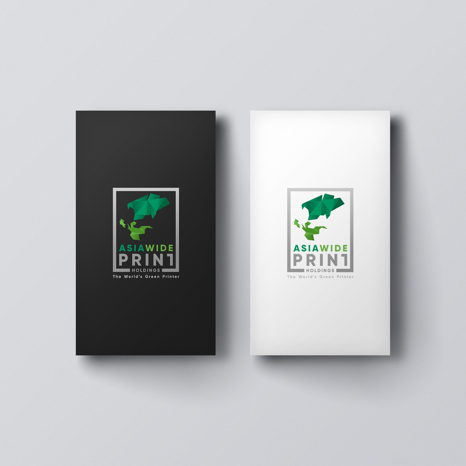
Ce client a reçu 197 designs de logo de la part de 63 designers. Il a choisi ce design de logo de aquabomb26 comme design gagnant.
Inscrivez-vous Trouvez des Projets de Design- Garanti
-
 S$375
S$375
-
 197 designs
-
 63 designers
Brief de Design de Logo
Improvise the attached sample logo! The "origami-folds" logo design depicts parts of the Asia continent. We feel that it can be improved further with more 'obvious' folding-patterns. Please tweak it to a better look which is modern and refreshing. We are planning to keep brand continuity so that our customers who are familiar with our brand will continue to recognize who we are.
MUST include the write-ups of the below:
i) Logo design explanation
ii) Suggested Vision, Mission and Values (for Asiawide Print)
iii) Brand Story (for Asiawide Print)
iv) Suggested Trends & Unique Selling Point (USP) in Print that Asiawide Print can follow/develop
[GUARANTEED] Winner will be selected based on the revised logo proposal AND the write-up proposals.
-----
LOGO REVISION (to take note):
1. STYLE: A youthful, modern and professional look & feel.
2: COLOURS: To be incorporated in the logo are Asiawide Spring Green, Asiawide Pine Green, Dark Grey. (CMYK value attached in image reference) Can use either one of the green colour, or even both green together. If you feel like other green shades are nicer, please suggest.
3. FONTS: Please suggest and change preferably to a san-serif font, which reflects a youthful and professional look.
4. ICON / SYMBOL: To maintain, yet simplify/modernise the "folds" which represents Asia map region. Beautify it and make it appear cleaner.
Tips:
- When designing, please consider that the logo has to look good in reverse white as it is in colour too.
- Logo has to be a combination mark which includes the folded map symbol and wordings "Asiawide Print", DO NOT submit just a wordmark.
- Do submit as many revisions as you can design for a higher chance of being the contest winner.
Thank you and good luck!
Mises à jour
Extended by Admin
Marché(s) Cible(s)
Targeting age 20-45 existing and new consumers & businesses to print from us.
Secteur / Type d'entité
Printing
Texte du logo
Asiawide Print Holdings
Styles de logo qui vous intéressent
Logo pictural
Un objet réel (texte facultatif)
Styles de police à utiliser
Aspect
Chaque curseur illustre les caractéristiques de la marque client et le style que doit transmettre votre design de logo.
Élégant
Audacieux
Léger
Sérieux
Traditionnel
Moderne
Sympathique
Professionnelle
Féminin
Masculin
Coloré
Conservateur
Économique
Haut de gamme
Exigences
Doit avoir
- MUST include the write-ups of the below:
- i) Logo design explanation
- ii) Suggested Vision, Mission and Values (for Asiawide Print)
- iii) Brand Story (for Asiawide Print)
- iv) Suggested Trends & Unique Selling Point (USP) in Print that Asiawide Print can follow/develop
Bien d'avoir
- Tips:
- - When designing, please consider that the logo has to look good in reverse white as it is in colour too.
- - Logo has to be a combination mark which includes the map symbol and wordings "Asiawide Print", DO NOT submit just a wordmark.
- - We have attached a few logo samples of what "Logo Refresh" means.
- - Do submit as many as you can design for a higher chance of being the contest winner.
Ne doit pas comporter
- DO NOT submit just a wordmark