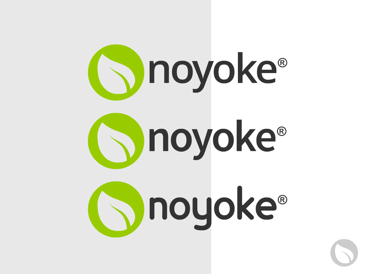
Finally Ready! National health and wellness initiative LOGO

Vous souhaitez remporter un projet comme celui-ci ?
Ce client a reçu 123 designs de logo de la part de 14 designers. Il a choisi ce design de logo de REDcrackers.com comme design gagnant.
Inscrivez-vous Trouvez des Projets de Design- Garanti
Brief de Design de Logo
We need a logo for a new company called noyoke (pronounced "No Yoke") health and wellness. We are at lifeisnoyoke.com/about . We deliver original content for subscribers and searchers. While our exact business model is a bit undefined, the purpose is very clear-help people help themselves and then others for grassroots improvement in health of nation.
We would like to see a simple designs that embody our general mission. We would like to subtly use bright green as is used currently on the site. The final logo should communicate a lifestyle that is innovative, creative, and smart.
Our website's overall look is not finalized so please do not align your design with the font used. We are looking for inspiration from you!
Mises à jour
Let's exclude the words 'health and wellness' from design submissions. Thank you.
Added Monday, December 17, 2012
Marché(s) Cible(s)
Educated urban dwellers
Secteur / Type d'entité
Health
Texte du logo
option 1: noyoke health & wellness option 2: LNY option 3: noyoke
Styles de logo qui vous intéressent
Logo abstrait
Conceptuel / symbolique (texte facultatif)
Logo mot symbole
Logo (texte seulement)
Logo de Lettermark
Acronyme ou logo texte (texte seulement)
Aspect
Chaque curseur illustre les caractéristiques de la marque client et le style que doit transmettre votre design de logo.
Élégant
Audacieux
Léger
Sérieux
Traditionnel
Moderne
Sympathique
Professionnelle
Féminin
Masculin
Coloré
Conservateur
Économique
Haut de gamme
Exigences
Doit avoir
- Something that is easily and subtly brand-able on retail items (workout pants, for example). Think LuLuLemon.
Three colors max, we think.
Bien d'avoir
- We have a green exercise ball in our office that we would love to see a part of the logo. It can be very small.
Ne doit pas comporter
- First thing people generally think of when they see our name is egg yolks. Since we only want associate ourselves with good / services we like, we want to avoid any semblance of a fried egg, especially any type of egg yolk.