msh iron works logo design MODIFICATIONS
Vous souhaitez remporter un projet comme celui-ci ?
Ce client a reçu 22 designs de logo de la part de 10 designers. Il a choisi ce design de logo de debdesign comme design gagnant.
Inscrivez-vous Trouvez des Projets de Design-
 US$200
-
 22 designs
-
 10 designers
Brief de Design de Logo
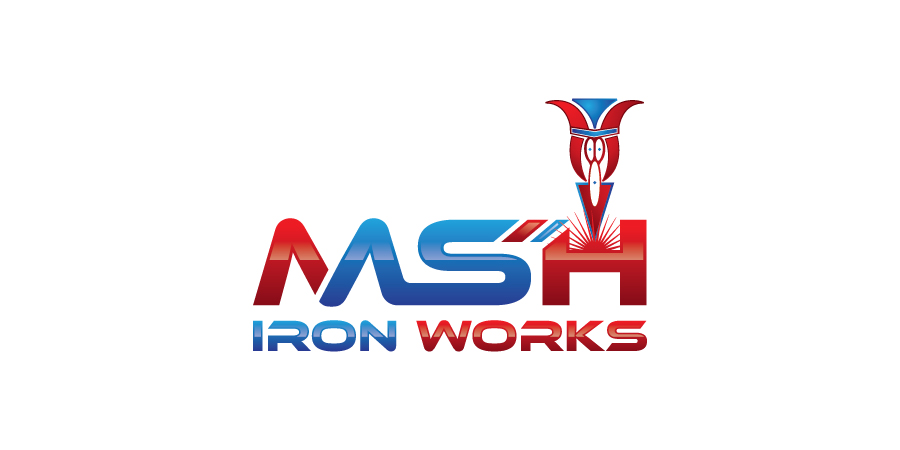
Hi, my name is Edgar I will like to know if you can help me by polishing my rough design. I will want to make this look more professional and clean looking. THE ORIGINAL ICON MUST REMAIN THE SAME. I want to keep the colors in the icon on top of the letter "M" but I'm open to change the colors of the fonts. My business deals with steel structure erections as well as fabrication and welding. To explain the logo I send to be used as a foundation, the icon on top of the letter "M" is striking an electric arc there for creating a weld and depositing welding material inside the letter "M". the red lines resemble sparks coming out of the material being welded. I will like to aim the look of the logo towards the "steel structure, welding, iron works" theme making it tuff looking yet keeping it clean and professional.Best regards EDGAR.
Marché(s) Cible(s)
Construction and manufacturing
Secteur / Type d'entité
It Professional
Texte du logo
MSH Iron Works
Styles de logo qui vous intéressent
Logo abstrait
Conceptuel / symbolique (texte facultatif)
Logo de Lettermark
Acronyme ou logo texte (texte seulement)
Styles de police à utiliser
Aspect
Chaque curseur illustre les caractéristiques de la marque client et le style que doit transmettre votre design de logo.
Élégant
Audacieux
Léger
Sérieux
Traditionnel
Moderne
Sympathique
Professionnelle
Féminin
Masculin
Coloré
Conservateur
Économique
Haut de gamme
Exigences
Doit avoir
- MUST KEEP ORIGINAL ICON BUT MOVE ORIGINAL ICON FROM ON TOP OF LETTER "M" TO ON TOP OF LETTER "H" & PLAY WITH COLORS OF FONT AND LETTERING STILES
Bien d'avoir
- Structural look
Ne doit pas comporter
- Caricatures such cartoons pics