Stationery for Avondale Baptist Church
Vous souhaitez remporter un projet comme celui-ci ?
Ce client a reçu 48 designs de papeterie de la part de 10 designers. Il a choisi ce design de papeterie de orkeny toria comme design gagnant.
Inscrivez-vous Trouvez des Projets de Design- Garanti
-
 NZ$600
-
 48 designs
-
 10 designers
Brief de Design de Papeterie
We need a range of stationery items designed for our active, community-orientated, out-going, all-age, family-friendly church in central Auckland, New Zealand.
We want to refresh and modernize the branding/images for Avondale Baptist Church itself so this image reflects who we are and our values.
Our church is located on a very busy intersection in the heart of a multi-ethnic local community. A number of churches and other groups use our site so we have branded our site as "The Intersection". We have an existing logo for "The Intersection" (see attached).
We would like you to design 4 items: a Letterhead, a With Compliments slip, a Business Card, and the Front Cover of our church newsletter, but we've included a request for an Email signature as an optional extra for this brief.
Organisation Details:
Name: Avondale Baptist Church
Postal Address: PO Box 19727, Avondale, Auckland 1746
Email: office@avondalebaptist.org.nz
Phone: 09 828 0182
Web: www.avondalebaptist.org.nz (current website will be changed)
Position Statement: "a place of hope, belonging and worship"
Fonts:
The fonts for the "The Intersection" logo are Futura Medium BT and Futura Lt BT. We would like the Futura font family used in the designs but feel free to add other fonts as appropriate (preferably True Type open source ones).
Colours:
Our current external signage colours are Dark Grey (Resene Paints 'Ironsand' - RGB 57-55-53 ) and orange ( Resene 'Adrenalin' - RGB 255-82-0 ). These are the colours for 'The Intersection' which is our site. As we have other churches using our premises also we are looking to create a separate but complimentary identity for Avondale Baptist Church with a different colour set. We would ideally like a primary colour, a complimentary colour and an offset colour.
Design:
For the Avondale Baptist Church stationary we want the design to incorporate some of the elements of the 'Intersection' particularly the extended 'T' device, so that we develop a separate identity but in the same family. We would like something that will look good for a number of years, rather than something that will date quickly in a year or two as fashions change.
PROJECTS
1. Letterhead
Finished size A4 (210 mm wide x 297mm tall)
This will become a template in MSWord. It will be printed in colour on our office photocopier so it must have a 5mm white border around the entire outside edge of the A4 page. "The Intersection" logo needs to be incorporated in some form on the page.
2. With Compliments slip
Finished size 210 mm wide x 99 mm tall
This will be printed in colour on our office photocopier so it must have a 5mm white border around the entire outside edge of the slip. We will print these slips 3-up on an A4 page. The actual design space will be 200mm x 89mm. It is envisaged that this slip will use the same elements as the letterhead design. Please supply two versions, with and without the words "With Compliments".
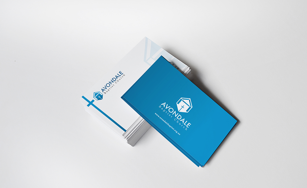
3. Business Card
Finished size 90 mm wide by 55 mm tall.
This will be printed by commercial printers so colours can run to the edge of the card. Your Avondale Baptist Logo with the extended 'T' devise will need to feature on this.
4. Front Cover of Church Newsletter
Finished size 100 mm wide x 210 mm tall.
Our newsletter is printed in landscape on A4 paper and is folded twice.
It will be printed in colour on our office photocopier so it will need to have a minimum 5mm white border on all 4 sides. Attractive inviting colours preferred.
Needs to have:
- a place for the words Sunday and a date (which will change each Sunday)
- your Avondale Baptist Logo with the extended 'T' devise
- the words Sundays @ 10am
- the words ""a place of hope, belonging and worship"
- optional - "The Intersection" logo (background does not need to be black)
5. Email Signature - optional extra
Not too large but something that will enable those receiving emails to instantly recognize who the email is from. Needs to include your Avondale Baptist logo, the name of the person, their position and our contact details.
Mises à jour
Project Deadline Extended
Reason: We are extending the deadline on this project in order to encourage a broader range of designs, both from those who have already submitted designs and from those who are considering entering our competition. We'd love to see what you have to offer so please do submit your designs.
Added Monday, October 06, 2014
Re: Stationery for Avondale Baptist Church
Thanks to all the designers who have submitted designs for our competition so far. We have refrained from requesting a whole lot of tweaks to individual designs out of respect for your time as we understand that you are all busy professionals and that design competitions like this are just one way that you pitch for new business.
We would though like to offer some general comments on the submissions that we have seen so far. One thing that we would definitely like to arrive at via this process is to decide on a colour scheme. For this, as per the brief notes ( but possibly obscured by some of the other detail ) we want to have a primary colour and an offset colour and also an accent colour in the pallet.
Another thing that we maybe didn't make clear enough is that the colours for the identity of the site, known as the Intersection, uses dark grey and orange but that we wanted to develop a separate but related identity for Avondale Baptist Church that meets there as we also now have other congregations that use our buildings.
One of the keys for the new identity will be the new colour pallet which we wanted to steer away from the darker tones that we used for the site branding. Therefore we would very much like to see your suggestions one or two secondary colours along with the primary brand colour if possible please.
Thank you all once again.
Kind regards
Added Friday, October 10, 2014
Secteur / Type d'entité
Business
Styles de police à utiliser
Couleurs
Le designer choisit les couleurs à utiliser dans le design.
Aspect
Chaque curseur illustre les caractéristiques de la marque client et le style que doit transmettre votre design de logo.