PowerPoint/Keynote Design Project - Aspects
Vous souhaitez remporter un projet comme celui-ci ?
Ce client a reçu 28 designs de PowerPoint de la part de 5 designers. Il a choisi ce design de PowerPoint de MAS comme design gagnant.
Inscrivez-vous Trouvez des Projets de Design- Garanti
-
 US$200
-
 28 designs
-
 5 designers
Brief de Design de PowerPoint
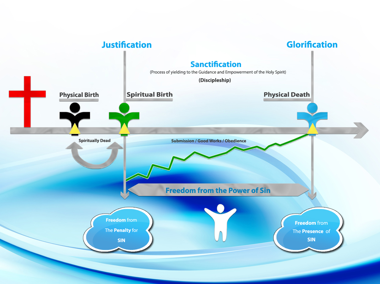
I need a fairly straightforward design for a presentation I currently use in Keynote. It is very basic, as I developed it in an Excel spreadsheet and a friend helped migrate it over to Keynote.
I don't want it to be overly complex and I don't want it to be too busy. It should not contain too many distracting elements, but I think it needs some professional design changes to make it more appealing to the eye. I think colors should be soft and not flashy; transitions should be simple.
==================================
In response to several questions received, I have added two files. One file is the actual presentation I currently use. I run it in Keynote but I uploaded it in Powerpoint. As you can see, it is a single page but it is developed sequentially.
The other file (Examples) is just a random selection of slides I chose from several unrelated presentations I use. I am providing this to illustrate the range of colors, type styles, and combinations I frequently use. However, this isn't meant to limit the choice of colors you might recommend. I am open to any colors which might enhance the overall effect of the presentation without overpowering its message.
Thank you for all the comments and questions I have received thus far.
Secteur / Type d'entité
It Professional
Aspect
Chaque curseur illustre les caractéristiques de la marque client et le style que doit transmettre votre design de logo.