Positronic Logo Concept
Vous souhaitez remporter un projet comme celui-ci ?
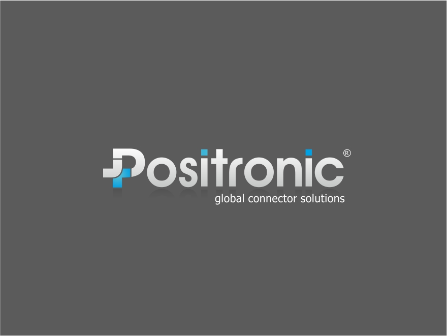
Ce client a reçu 677 designs de logo de la part de 144 designers. Il a choisi ce design de logo de Logocraft comme design gagnant.
Inscrivez-vous Trouvez des Projets de Design- Garanti
-
 US$900
-
 677 designs
-
 144 designers
Brief de Design de Logo
We need a new OR revised logo design for a global re-branding initiative. Positronic is a global company with a global customer base. We make electrical connectors for use in high quality end products like military equipment, medical imaging machines, aircraft, satellites, etc. Our products are known for being high quality and very reliable. Our products provide a disconnect for the movement of electrical signals from point A to point B. Some of our connectors carry a lot of power (amps), some only carry signals. See http://www.connectpositronic.com/products/ for product examples. We would like a logo that is clean and modern with a subtle international touch. Our USA division uses Pantone 2945C a lot on existing marketing literature. Our Asian division likes the color purple due to its significance in that part of the world. We also like charcoal greys and orange. That said, we are open to creative, out-of-the-box thinking and welcome fresh ideas. The company name is loosely based on the positron particle and Isaac Asimov's "positronic brain" concept (http://en.wikipedia.org/wiki/Positronic_brain and http://en.wikipedia.org/wiki/Positron). This may give you some creative inspiration.
Updates
Hello designers. Thank you for all of your hard work. Lots of great ideas being submitted. I have another idea to throw at you. Wrigley's gum has a '5' logo that we like a lot. We are thinking this could be a source of inspiration for our logo. Maybe the 'P' could act like the '5' in the Wrigley's logo. See this link for an example: http://www.claytowne.com/beats-digging-ditches/wp-content/uploads/2010/05/Wrigleys_5_Gum_Box_Dieline1.jpg. Thank you.
Added Friday, November 16, 2012
Another concept that occurred to me today - what if the emblem was only a version of a '+' sign? In other words no 'P' in the emblem just a plus sign. Then maybe we can accentuate the 'P' in the company name. Just an idea.
Added Monday, November 19, 2012
It seems I've upset some of you with my generic feedback. This is the first time I've used designcrowd.com and am getting used to it. I've received nearly 400 submissions in less than a week. I'm just finding it hard to provide constructive criticism for that many designs and do the other components of my job. I apologize if I've frustrated you, but I'm doing the best I can. Thanks.
Added Wednesday, November 21, 2012
Feel free to submit ideas with just a good modern font that's not futuristic looking. These ideas need some enhancement to the font and / or company name such as an embellished 'P' or something. A little tasteful flair to the font could be the ticket. Thanks.
Added Tuesday, November 27, 2012
Thanks to all of you who participated in our logo design project. Because there is an executive staff and a board of directors that have to approve the logo selection, we expect to take 30 days to choose our winner. I apologize for the delay, but given the amount of people that have to approve the decision, it will take that long. Thanks again!
Added Tuesday, December 04, 2012
Marché(s) Cible(s)
Mechanical engineers, electrical engineers and buyers are key targets.
Secteur / Type d'entité
Electrical
Texte du logo
Positronic
Styles de logo qui vous intéressent
Logo d'Enseigne
Logo contenu dans une forme
Logo pictural
Un objet réel (texte facultatif)
Logo abstrait
Conceptuel / symbolique (texte facultatif)
Logo mot symbole
Logo (texte seulement)
Logo de Lettermark
Acronyme ou logo texte (texte seulement)
Aspect
Chaque curseur illustre les caractéristiques de la marque client et le style que doit transmettre votre design de logo.
Élégant
Audacieux
Léger
Sérieux
Traditionnel
Moderne
Sympathique
Professionnelle
Féminin
Masculin
Coloré
Conservateur
Économique
Haut de gamme
Exigences
Doit avoir
- Our current logo can be seen at www.connectpositronic.com. It contains a 'P' and some '+' signs on it. Executive Management has a desire to retain the focus on the 'P' and have at least one '+' sign somewhere in the logo. That said, an amazing logo that deviates from one or both of those requirements may still be considered. If special fonts are used, we need to be able to purchase the font for future use.
Bien d'avoir
- These are just some ideas that might get you started - these are not hard requirements.
1. The '+' sign could be integrated into the 'P' by cutting in along the edge of the letter or along the edge of an emblem of some sort.
2. The logo could integrate the abstract concept of a connector but be careful not to put too much detail since the logo may be very small in some marketing literature.
3. Two of the attached files show you some existing logos for Positronic and for PosiShop, a related brand. The other attachments are scientific representations of positrons colliding with electrons and showing you the result. These shapes could provide some abstract inspiration if you are wanting to take the logo in an abstract direction.
Ne doit pas comporter
- We don't want anything too gimmicky, corny, cheesy, or word art looking.