Webdesign/ Redesign of community frontpage (only design, no code!)
Vous souhaitez remporter un projet comme celui-ci ?
Ce client a reçu 27 web designs de la part de 16 designers. Il a choisi ce web design de choi comme design gagnant.
Inscrivez-vous Trouvez des Projets de Design- Garanti
-
 €175
€175
-
 27 designs
-
 16 designers
Brief de Web Design
Our social community website (http://www.mygi.eu) needs a fresh, more invitating frontpage. Our audience are 14 - 25 year old.
Only the screen design (psd & image) is needed, no code (no html, no css, ...).
Style:
- Modern/ clear/ lightweight/ invitating design for young people
- Emphasize the intent of the website (social community website, meeting other young people to chat, hangout, ..)
- Optimized for 1024x768
Elements that must appear:
- Logo (attached as EPS, can be modified if needed)
- Login form (Username, Password, Status/Feeling, Forgot password link, ...)
- Link to registration page OR registration form
- Empty space (around 350x250 pixel) where a video or other dynamic content could be embedded (done by myself)
- Five feature/pro statements (max. 60 letters each, not necessarily to be displayed as a group, see below)
- Currently present links in footer
- Some statistics (Number of people online, total number of members (females/ males))
Elements that might appear:
- Registration form instead of link to separate registration form (ex like facebook has it)
Ideas:
- Registration form could also be designed to be a layer that'll show when the user clicks
- If the design needs/allows it, I can also animate random member photos (80x80 pixels) and place them on the frontpage using js/ ajax
Feature/pro statements examples (see above):
- Dauerhaft kostenlos für Frauen und Männer
- Reale Profile, extrem wenig Fakes & Störenfriede
- Persönliches Profil mit vielen Funktionen
- Hoher Schutz deiner Privatsphäre und Daten
- Viele freundliche Mitarbeiter und Helfer
Mises à jour
After having reviewed the first two designs, I'd like to give these general ideas/ feedback:
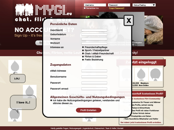
1. I think it would be much better to _not_ have the whole registration form on the frontpage but instead only a link which opens the form in a layer/dialog when clicked. Of course only the design of the dialog needs to be done, I'll do the actual coding. To have a first impression of how the dialog could look like, please see the newly attached dialog.png (the text in the dialog is just for demo and should be replaced by the actual registration form).
2. There should be no separation between males/ females like it is currently. I think it'd better to mix because it emphasizes the community/ group character of the site and does not make it look too much like da dating site.
3. I think the five statements/ pros I mentioned (why should people register, what are the greatest features of our site, ..) could be best displayed as balloon tips (just like in comics) next to some images of users.
4. The color of the site should not be too heavy and should make people feel comfortable.
5. The logo provied must be fixed to read "MYGI.eu" instead of
"GIMY.de". I hope this i no big deal, sorry for that. This could also be
done afterwards for a small additional amount of money, as it doesn't
really affect the overall design.
Added Friday, December 10, 2010
To better illustrate all my writings above I just made two simple sketches and attached them (frontpage.png and frontpage_with_active_registration.png).
Added Saturday, December 11, 2010
Just to emphasize, the design should not look or feel heavy. So please keep the colors light/ soft, no huge images, don't stretch the logo to much, etc.
Please do not insert any content (like search boxes, text blocks, etc.) which is not already present in my mockups. The only thing that should be additionally added is a link/ button so people can login using openid (facebook, google, ..) too.
Added Thursday, December 16, 2010
Marché(s) Cible(s)
Young people 14 - 25 years old interested in meeting friends, new people, chat, flirt, hangout, have fun.
Secteur / Type d'entité
Community
Aspect
Chaque curseur illustre les caractéristiques de la marque client et le style que doit transmettre votre design de logo.
Élégant
Audacieux
Léger
Sérieux
Traditionnel
Moderne
Sympathique
Professionnelle
Féminin
Masculin
Coloré
Conservateur
Économique
Haut de gamme
Exigences
Doit avoir
- see description
Bien d'avoir
- see description
Ne doit pas comporter
- plugin dependencies (ex flash)