Shelf Talker for craft mead in bottle shops
Vous souhaitez remporter un projet comme celui-ci ?
Ce client a reçu 16 designs de Flyer de la part de 4 designers. Il a choisi ce design de flyer de Purple Hearts comme design gagnant.
Inscrivez-vous Trouvez des Projets de Design-
 US$140
-
 16 designs
-
 4 designers
Brief de Design de Flyer
Hello!
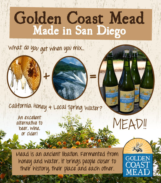
We need a shelf talker, a 3.75"wx4.25"l card/flyer which will be posted to hang off the shelf under our bottles of craft local mead that we sell here in San Diego. We want something good looking, crafty, confident and engaging that shows the customer "California Honey+Local Spring Water+fermentation (a magical process) = Mead! You should try it! Made in San Diego, enjoyed by San Diegans!"
The design should be more artful than linear, but still clear and easy to understand. It should draw on art nouveau and old fruit box labels, with the abundant, beautiful, laid back, generous spirit of California.
Marché(s) Cible(s)
21-39 year old San Diegans, professionally or creatively employed, craft beverage enthusiasts, local food enthusiasts, farmers market shoppers.
Aspect
Chaque curseur illustre les caractéristiques de la marque client et le style que doit transmettre votre design de logo.
Élégant
Audacieux
Léger
Sérieux
Traditionnel
Moderne
Sympathique
Professionnelle
Féminin
Masculin
Coloré
Conservateur
Économique
Haut de gamme
Exigences
Doit avoir
- 3.75"wx4.25"l
Representation of honey
Representation of local spring water
Representation of fermentation process-such as a steel tank, yeast, bubbling golden mixtures of honey and water fermenting away.
A succinct statement in words to the effect of, "Golden Coast Mead, Made in San Diego"
Bien d'avoir
- The flyer could have a background of the semi-iconic orange groves in San Diego county.
Any use of themes related to culture, community, environment, locality, place, local food, craft industry, passion, quality, agrarian goodness in a modern city, are all suitable.
A consistent feel with our logo and design as seen on www.goldencoastmead.com
Ne doit pas comporter
- Would rather avoid neon.
Would not like to see a design that is overwrought. Better to be playful and simple than overdone.