Boating Magazine Logo
Vous souhaitez remporter un projet comme celui-ci ?
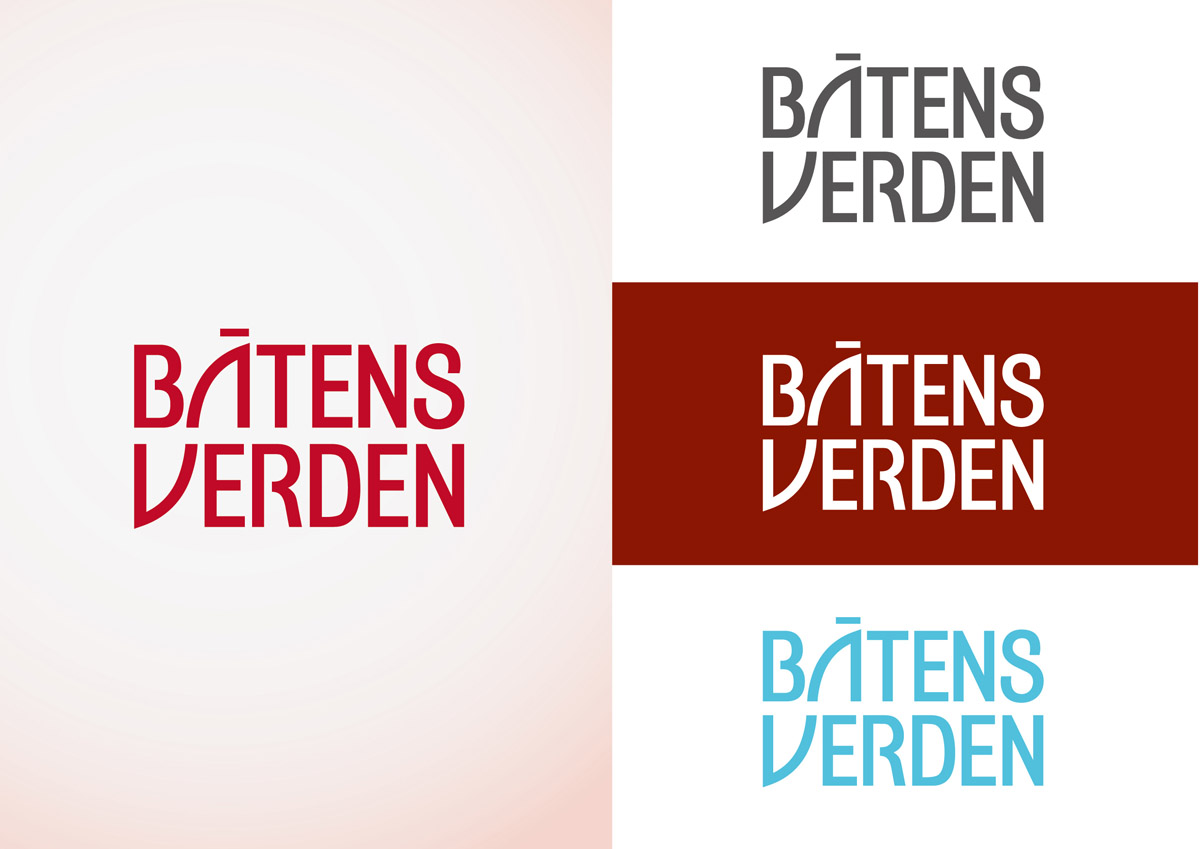
Ce client a reçu 107 designs de revue de la part de 20 designers. Il a choisi ce design de revue de boobeeboo comme design gagnant.
Inscrivez-vous Trouvez des Projets de Design- Garanti
-
 US$400
-
 107 designs
-
 20 designers
Brief de Design de Revue
Norwegian Boating Magazine Båtens Verden is one of Norway's biggest leisure boating magazines, with an audience of 100,000 boat owners. Our readers are generally above average wealthy, but nevertheless "down to earth" people, from 30-60 years old. The majority are male readers, but we have female readers as well.
We need a new logo in order to make Båtens Verden visible in the newsstands, and get a more distinct visual profile. The new logo should strengthen our brand and increase sales. Our current logo (see files) is too childish, not visible at all in the newsstands, and is definitely not something to be inspired by. It is, however, important that the logo will fit in on the magazine cover (see files). A logo which must be in the color blue, would e.g. not work on a blue sea/sky background.
The new logo will be part of a relaunch of the magazine in 2013, which means we're open to logo submissions that doesn't necessarily fit in with the old cover design in regards to headline fonts, layout etc. It is, though, important to remember that this is a boating magazine, and the main cover photo will probably be somewhat similar to our previous issues, also in the future.
The word "Båtens" means "The Boat's", and "Verden" means "World".
Marché(s) Cible(s)
Boat Owners, People who are interested in boat/boating
Secteur / Type d'entité
Sales
Aspect
Chaque curseur illustre les caractéristiques de la marque client et le style que doit transmettre votre design de logo.
Élégant
Audacieux
Léger
Sérieux
Traditionnel
Moderne
Sympathique
Professionnelle
Féminin
Masculin
Coloré
Conservateur
Économique
Haut de gamme
Exigences
Doit avoir
- - The text "Båtens Verden" in it
- Must fit on the cover of the magazine (A4), and be large and clearly visible on the cover in the newsstands
- A typeface and design that works at both large and small scales
Bien d'avoir
- Be able to use the logo in different colors
Ne doit pas comporter
- - We haven't built a brand around the abbreviation "BV", so you should not use this in the design
- Small/busy graphic elements