Web Design Concept for new social network
Vous souhaitez remporter un projet comme celui-ci ?
Ce client a reçu 43 web designs de la part de 8 designers. Il a choisi ce web design de Fuxxo Works comme design gagnant.
Inscrivez-vous Trouvez des Projets de Design- Garanti
-
 £415
£415
-
 43 designs
-
 8 designers
Brief de Web Design
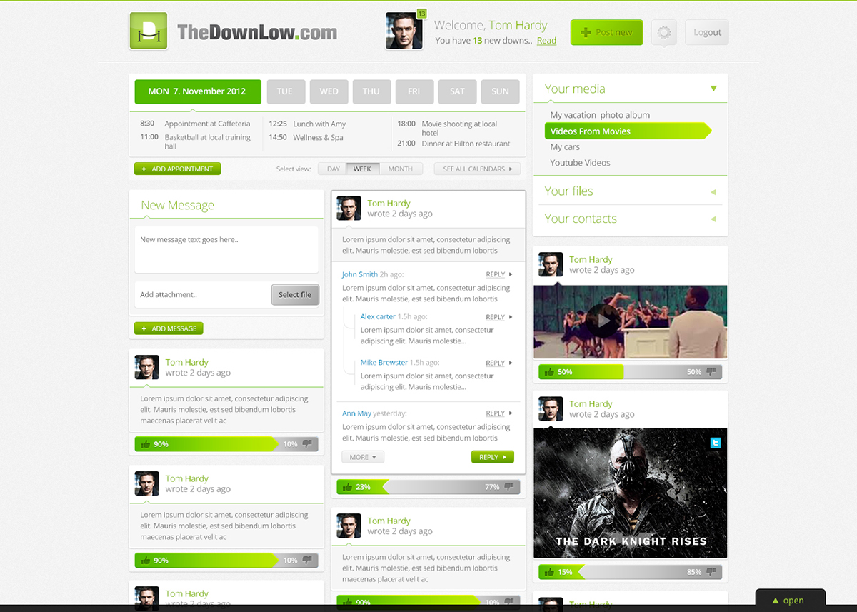
We need a fresh, vibrant, clean web design layout for a new social network that we are trying to put together.
The site itself will be stuffed with little jquery/css tricks to enable a better/better looking UI (this is where you come in).
Imagine you were re-imagining Facebook.. How would you have designed it? The new site, will have a lot of similar functions to FB, and then a few more.
I will need a great looking sign in page in addition to;
The main page will need to have the following elements;
- Profile header.
Profile picture and tabbed area for various pieces of meta data contact details, preferences etc
- A Post Wall (like the wall on FB, but its crossed with a twitter-esque global search/post). People can respond to not only the original message, but can reply to each individual reply.
Instead of LIKE, there will need to be a positive/negative/neutral style option (feel free to get creative with naming). The background of each post will reflect the average rating (pos/nuetral/neg) of the post itself.. so if 100 people click pos, 50 neutral and 1 negative, the bg will mainly be the positive colour).
The feed will include messages by default from many sources (facebook/twitter/linked in) there should be somewhere that these can be switched on and off...
Somewhere to post a message - again by default it will post to all networks, but should be able to switch off.
Images/Videos/Text can all be posted to the wall (if you can think of a better name than wall - please use that!)
- Notifications; rather than having them in a drop down menu like fb, i want them to be in a hidden div (one div for each type) that slides open to reveal the notifications.. The default will be that the divs are closed so if there is a new notification there will be a need for something to appear on the screen that the user can click. We will need 3 notification types.
- Calendar; collapsable
- Options for today/this week/month views etc
- Menu system to navigate to other screens.
This should be able to show available things like groups/pages/events (again feel free to rename).
The screens themselves should appear to be stacked (like stacked tiles).
- Search; there should be a search bar somewhere with various options being available.
- Modal popup. I will be using modal popups across the site so will want a consistant feel (should be able to display photos/videos etc)
I will upload some files over the next few days to support the above, but am really looking for your creativity here.
Sites I really like the style of:
- the NEW myspace (check it out.. its awesome).
- apple
- twitter
I want a really clean interface, modern.. splashes of colour are fine (but only where it will enhance).
Mises à jour
I have added a file to the uploads that gives an idea of how the notifications should be revealed.. Please do not read too much into any styling... i created the pdf just to show how i expect the notifications to be revealed, and that I expect there to be multiple notification types.
Added Tuesday, October 23, 2012
Although I deliberately didnt request adverts to be shown in the brief, i also didnt explicitly state that they shouldnt be! The site will NOT feature adverts so please do not show them on the design. Id much rather that the space be used to improve layout.
Added Wednesday, October 24, 2012
Project Deadline Extended
Reason: Waiting for 1 designer to submit; due to religious holiday.
Added Monday, October 29, 2012
Added Tuesday, November 06, 2012
Marché(s) Cible(s)
18 to 40 - again, think facebook/twitter/linkedin
Secteur / Type d'entité
Events
Aspect
Chaque curseur illustre les caractéristiques de la marque client et le style que doit transmettre votre design de logo.