Vehicles Brochure Diagram
Vous souhaitez remporter un projet comme celui-ci ?
Ce client a reçu 21 designs graphiques de la part de 8 designers. Il a choisi ce design graphique de Jozbel comme design gagnant.
Inscrivez-vous Trouvez des Projets de Design- Garanti
-
 A$140
A$140
-
 21 designs
-
 8 designers
Brief de Design Graphique
Task Outline
Create diagrams for our new vehicles brochures
Task Description
Who are we:
GSB is New Zealand's largest Business Group Buying organisation, helping organisations nationwide reduce their running costs. We offer members the best deals from over 100 Contracted Suppliers, anything from vehicles, stationery to electronics and coffee.
The project:
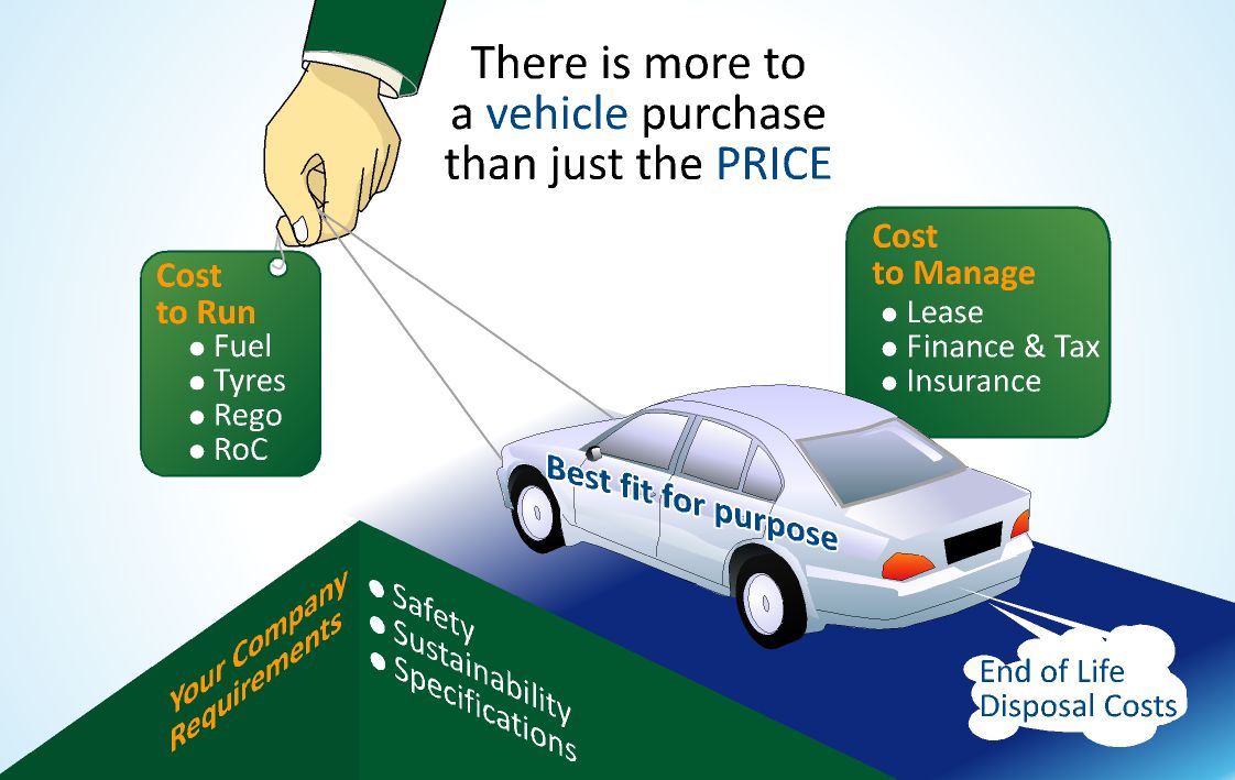
We need 2 diagrams to illustrate the benefits of our vehicle services. The diagram will be used in our brochures (example attached)
1. A Diagram illustrating/explaining the elements that are involved in purchasing a new car & how our service ties it all together to provide the best solution.
- Please see the Diagram 1 PDF for a rough wireframe of the elements involved
2. Another small diagram inserted on an separate page to demonstrate how our services can increase safety & profit and reduce costs & risks (PDF: Diagram 2 Details)
The design needs to be clean, clear and simple that it’s easy to understand within a few seconds of looking at it. Feel free to explore with different elements in the realm of infographics, flowcharts & diagrams to best communicate the idea visually.
Mises à jour
Just thought I’ll share some of the feedback we’re giving tosubmissions that have been coming through to help with new submissions
-Challenge & be creative about the ways you demonstratethe elements
-We don’t want to see your design replicating the ones that isdrawn. The purpose of it is only to provide you with the content in context
-We can’t emphasis enough that the style pdf is only areference and not the look you should imitate.
If you have any question please feel free to contact me.Looking forward to see your designs!
Added Thursday, October 11, 2012
Project Deadline Extended
Reason: We're keen to see more approaches & creative ways of interpreting the content rather than a standard cycle diagram.
Entries so far have been good but quite literal, we will provide feedback to help steer it in the right direction.
Added Saturday, October 13, 2012
Marché(s) Cible(s)
Business professionals, Decision makers on a corporate level & prospects.
Secteur / Type d'entité
Electronics
Aspect
Chaque curseur illustre les caractéristiques de la marque client et le style que doit transmettre votre design de logo.
Élégant
Audacieux
Léger
Sérieux
Traditionnel
Moderne
Sympathique
Professionnelle
Féminin
Masculin
Coloré
Conservateur
Économique
Haut de gamme
Exigences
Doit avoir
Likes – simple, clean & clear, uncluttered
Dislikes – Overcrowded images, text, & colours. Overly expressive typeface. Please no literal illustration of our sketches or colored version of our sketch.
Font: -Myriad Pro
Colour: Please refer to the color palette in the ‘Diagram Color & Style’ PDF
The brochures are attached with content to provide context that might inform the design better,
Dimensions & the amount of space you have to work with will also be highlighted