Innovative Water AWESOME Packaging Design
Vous souhaitez remporter un projet comme celui-ci ?
Ce client a reçu 120 designs emballage de la part de 22 designers. Il a choisi ce design emballage de BigDreamer comme design gagnant.
Inscrivez-vous Trouvez des Projets de Design- Garanti
-
 €365
€365
-
 120 designs
-
 22 designers
Brief de Design Emballage
Hi everyone. Enjoy the brief!
WHO WE ARE:
We are a French beverage company focusing on innovative products in order to break into the market. Our mission? We are resolved to give a serious kick to the fusty Water market! The product will be sold in many countries, including the USA.
WHY WE NEED YOU:
We are convinced that a great brand identity and packaging design are key elements to bring an innovative and novelty touch to our product.
We definitely need your help!
WHAT WE DO:
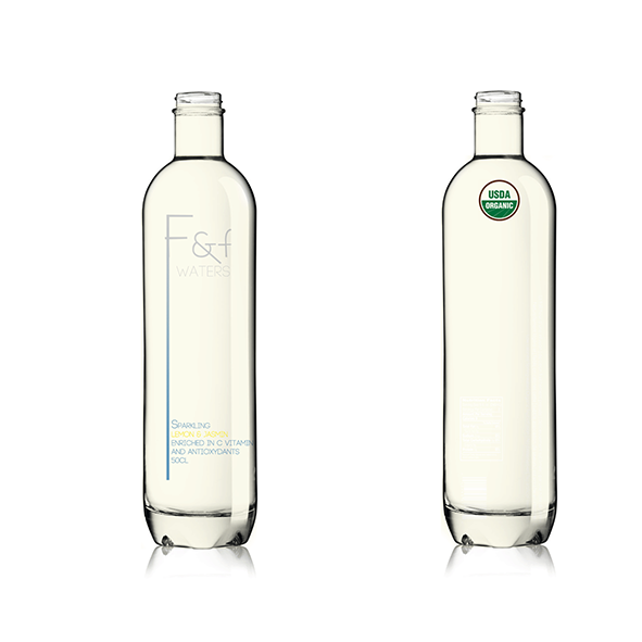
Fresh & Fruited Waters, known as F&F Waters, is a sparkling spring water infused with organic fruit & plants, enriched in vitamins and antioxydants. It comes in a 70cl trendy glass bottle.
Our first flavor is F&F Waters Lemon / Jasmin.
Color is transparent like water slightly yellow tainted, but crystal clear. You can see through.
We have a real high end positionning, almost luxury, but modern and young. In addition the product will have the Organic certification (USDA). It will then be distributed in Organic grocery stores, selected high-end selling points, delicatessen and five star hotels.
To help you identify our space we could say that we consider our products in the NIAGARA market space. (see inspirations attached)
YOUR MISSION:
1) Create a stunning and unique packaging design capable of creating awareness on its own.
2) To do so use the bottle attached and give life to our drinks.
3) Remember we are selling a unique, innovative and modern WATER. Not a drink, not a juice...The design will be better if you do not show fruits!!!
4) F&F Waters will be our logo. We would like the logo to be part of the label structure. The label has to be long and thin. See pictures called "inspiration" attached.
We would like you to use the slender aspect of the letter "F" in the design architecture which we believe will give a touch of modernity and will be aligned with our positionning.
THE TEXT THAT WILL APPEAR ON THE PACKAGE:
Front label, from Up to Bottom:
F&F Waters
fresh and fruited waters (optional)
sparkling
lemon & jasmin
enriched in C vitamin and antioxydants
50cl
Back label, from Up to Bottom:
F&F Waters (logo version)
(Text :)
La fraîcheur d’une infusion
de citron fraîchement pressée
délicieusement sublimée
par une note de jasmin.
Naturellement légère et
faible en calories cette
subtile association de saveurs
est enrichie en vitamines C
.
(Icons + text :)
Low calories
Spring water
Organic fruit infusion
No preservatives
No artificial sweeteners
USDA logo (see attached file)
Bar code space + Nutrition fact (see attached file)
WHAT WE WANT:
- A design that reflects our high end positionning
- A use of the letter F as part of the architecture
- A slender (thin and long) label and design
- An uncluttered, very simple and minimalistic design (see inspirations attached)
- To reflect an impression of modernity and novelty
- An instant feel of a luxury product
- The use of blue as our main color in order to stay in the WATER space (dark, light... whatever suits you)
- The use of colors to illustrate the flavors. NO FRUITS
- The use of a distinct font
- Highlight the logo and the word WATERS
WHAT WE DON'T WANT:
- We don't want a design that won't position us as an upmarket water brand
- We don't want our product to look like a drink made of juice or a soda
- We don't want to see the image of a fruit
- We don't want the design to be clutered or bold
This is all you need I guess!
Thank you very much for your participation. We appreciate the time and energy you will put into designing our packaging.
A big thank you from France.
Kind regards,
Michaël and Moïse from F&F Bev.
Marché(s) Cible(s)
Our clients are men and women mostly between 25 and 40 years old. Good purchasing power.
We would like the design to be modern and stylish.
Secteur / Type d'entité
Architecture
Styles de police à utiliser
Couleurs
Couleurs choisies par le client et à utiliser dans le design de logo:
Aspect
Chaque curseur illustre les caractéristiques de la marque client et le style que doit transmettre votre design de logo.
Élégant
Audacieux
Léger
Sérieux
Traditionnel
Moderne
Sympathique
Professionnelle
Féminin
Masculin
Coloré
Conservateur
Économique
Haut de gamme
Exigences
Doit avoir
- WHAT WE WANT:
- A design that reflects our high end positionning
- A use of the letter F as part of the architecture
- A slender (thin and long) label and design
- An uncluttered, very simple and minimalistic design (see inspirations attached)
- To reflect an impression of modernity and novelty
- An instant feel of a luxury product
- The use of blue as our main color in order to stay in the WATER space (dark, light... whatever suits you)
- The use of colors to illustrate the flavors. NO FRUITS
- The use of a distinct font
- Highlight the logo and the word WATERS
Bien d'avoir
- Use the bars of F&F to structure your label and make it unique. See inspiration on NIAGARA and B milk (files called "inspiration).
They have a great use of the font and the logo it self determines the label structure.
This is our top priority.
Second is to reflect our upmarket positionning through a modern aspect.
Ne doit pas comporter
- WHAT WE DON'T WANT:
- We don't want a design that won't position us as an upmarket water brand
- We don't want our product to look like a drink made of juice or a soda
- We don't want to see the image of a fruit
- We don't want the design to be clutered or bold