

 Rafraîchir
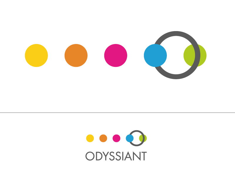
Logo for a new company
Vous souhaitez remporter un projet comme celui-ci ?
Ce client a reçu 106 designs de logo de la part de 41 designers. Il a choisi ce design de logo de hoch2wo comme design gagnant.
Inscrivez-vous Trouvez des Projets de Design
- Garanti
-
 £290
£290
-
 106 designs
-
 41 designers
Brief de Design de Logo
Odyssiant is a new software company. The software will allow the user to map audience journeys and then manage them for content marketing. The company name can be used in the logo, but we would like a symbol that represents the following: journey, odyssey, plan, engagement, trust.
Our corporate colours are the following RGB codes:
Grey: 91,91,91
Yellow: 251,206,0
Pink: 227,9,129
Green: 175,203,30
Light Blue: 0,161,226
Brown: 231,133,42
Our current fonts are Nexa & Nexa Bold, but it is not mandatory to stick to this. The font should be clear and bold. No shadows, underscores or other "treatment" of the text itself. The symbol should not overlap the text and vice versa, but can be joined to the text.

Mises à jour
Project Deadline Extended
Reason: Haven't quiet seen what we are looking for yet.
Added Saturday, July 05, 2014
We use the font Nexa and Nexa Bold with our other brands. We are not stuck on this, but please try this font with your designs. Thanks.
Added Saturday, July 05, 2014
The brief now has some further detail. We haven't seen what we are looking for yet so have provided so more description to help refine or develop the designs.
Added Monday, July 07, 2014
Secteur / Type d'entité
Software
Styles de logo qui vous intéressent
Logo pictural
Un objet réel (texte facultatif)



Logo abstrait
Conceptuel / symbolique (texte facultatif)



Styles de police à utiliser


Autres polices appréciées:
- nexa, nexa bold
Aspect
Chaque curseur illustre les caractéristiques de la marque client et le style que doit transmettre votre design de logo.
Élégant
Audacieux
Léger
Sérieux
Traditionnel
Moderne
Sympathique
Professionnelle
Féminin
Masculin
Coloré
Conservateur
Économique
Haut de gamme
Exigences
Doit avoir
- Strong colours, use as many of the colours as makes sense for your design and use them to make the design "pop"
We need the ability to reuse logo in different formats within presentations etc – i.e. flexibility of design
There needs to be a strategic sense of joining things together; interconnection and removal of silos
A sense of journey and movement
Professionalism, maturity and not .com
Shapes should be simple, elegant and connected with the brand name and not just a random stamp alongside and certainly not symbols that can be see anywhere else.