Logo Design Project

Vous souhaitez remporter un projet comme celui-ci ?
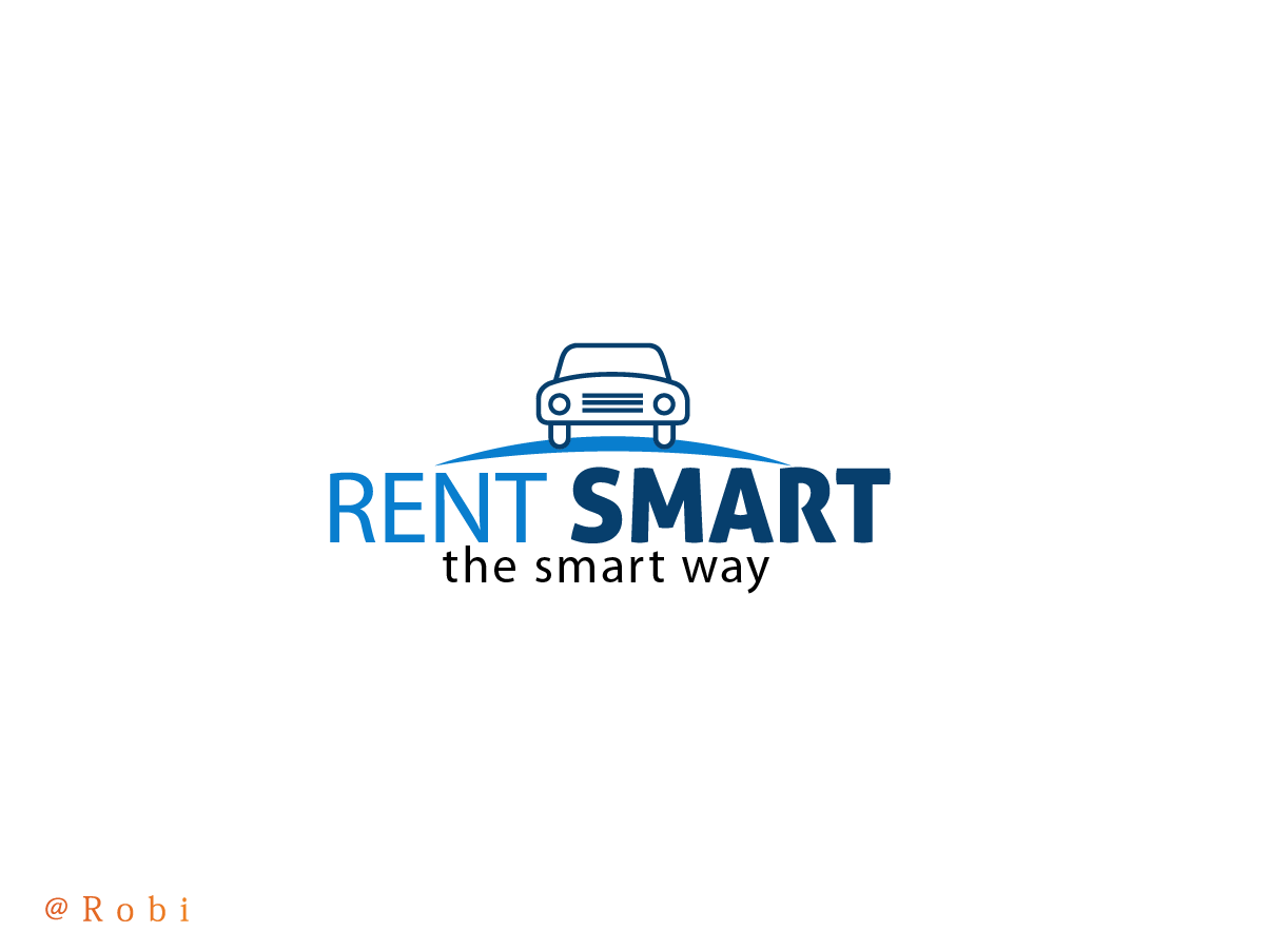
Ce client a reçu 112 designs de logo de la part de 19 designers. Il a choisi ce design de logo de Robi comme design gagnant.
Inscrivez-vous Trouvez des Projets de DesignBrief de Design de Logo
1. I want the logo should be based on the words, it should be put down in a nice unique way,
2. The word SMART should somehow be stronger then the word RENT, maybe with a darker color, or maybe make SMART thicker then RENT.
3. The logo will be used in colored and in b/w, so make it with colors that even when it’s a b/w copy it should look nice.
4. I don’t like the color red in the logo please.
5. Then I want the A from SMART should be made out of a car icon outline.
See attached what I mean how you can make an A from a car icon, when you bring out few outlines with a different color.
The car icon should match into the word “smart”.
“For example” I would do something like this: let say the word SMART will be blue, so the lines of the car that is being used to make it for an A, I would make that in blue as well, and the other lines of the car (that’s used to make it for a car, but you don’t need that for the A) should be in a different color, so you see it’s a car, but the A strikes more out.
Please note, the idea with the car icon for the A is not the main,
If you have any nice idea how to place a car in the logo, but it should be somehow like attached or connected or fitted in, or maybe come out from one of the letters, that's fine. I just don't want it should be a car without any connection to the words.
I mean to say, the car should be somehow a part of the logo, or this should finish the logo, not a few words that has a car by the side.
It should add to the logo.
Texte du logo
RENT SMART
Aspect
Chaque curseur illustre les caractéristiques de la marque client et le style que doit transmettre votre design de logo.