Revise our Visual Graphic - CPA firm
Vous souhaitez remporter un projet comme celui-ci ?
Ce client a reçu 27 designs illustration de la part de 6 designers. Il a choisi ce design illustration de bestwork comme design gagnant.
Inscrivez-vous Trouvez des Projets de Design-
 US$320
-
 27 designs
-
 6 designers
Brief de Design Illustration
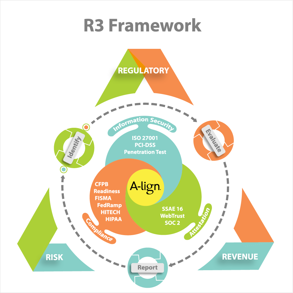
We are a small specialty CPA firm that provides consulting services to companies in three areas: Information Security, Compliance & Attestation.
We need a tool to present our range of services and how they help our customers. We might use this on the website and when meeting face to face with clients to talk through what we do and how we can help.
I'm seeking a revised and updated graphic presentation image to explain our services. This graphic framework image will be one we can use on our website and use when we sell and explain our services to our clients. This graphic framework is meant to be a visual tool to make is easier to explain what we do to our clients.
We have a graphic that we like, but we don't LOVE IT yet. Your mission is you choose to accept it is to professionalize our graphic design. (see attached graphic)
The overall "environment" is represented by RISK, REGULATORY, REVENUE. These are the 3 reasons people would hire us. The bigger picture eco system.
The three overlapping circles show are three major service categories and inside the circles are lists of the specific services we can provide. We have overlapping circles to show that we can save them money and time if we provide more than one type of service.
The words on the dotted lines are what we commonly do on each project which is 3 things: IDENTIFY, EVALUATE, REPORT. These three things we do for all of our services so a faint circle with arrows or somehow showing a circular ongoing process would be good.
As you can see we are using one graphic to show many things and relationships.
The title of this graphic is "R3 Framework"
I look forward to your great ideas! Thanks.
Mises à jour
Project Deadline Extended
Reason: Just to give a little more time after the weekend.
Added Tuesday, June 17, 2014
Marché(s) Cible(s)
Presidents and Vice Presidents of small companies.
Secteur / Type d'entité
Graphic Design
Couleurs
Couleurs choisies par le client et à utiliser dans le design de logo:
Aspect
Chaque curseur illustre les caractéristiques de la marque client et le style que doit transmettre votre design de logo.
Élégant
Audacieux
Léger
Sérieux
Traditionnel
Moderne
Sympathique
Professionnelle
Féminin
Masculin
Coloré
Conservateur
Économique
Haut de gamme
Exigences
Doit avoir
- Be able to show this visual on one page of a website or PowerPoint presentation without scrolling down.
All of the written text on my draft example must be used and fit into the new design.
Bien d'avoir
- When you design it think of how this can be used for both presentations, but also may be used on the website and people might click on different elements to learn more.
I picked some colors, but feel free to pick other colors. The only important thing to know is that the logo is black and yellow.