 Rafraîchir
Survey template design
Vous souhaitez remporter un projet comme celui-ci ?
Ce client a reçu 8 designs application de la part de 3 designers. Il a choisi ce design application de Lauren comme design gagnant.
Inscrivez-vous Trouvez des Projets de Design
- Garanti
-
 US$400
-
 8 designs
-
 3 designers
Brief de Design Application
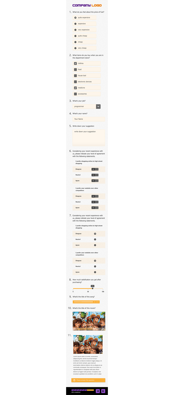
Build the default survey template for the surveys built using our survey builder application, Seeds.
The surveys are received and filled in, on mobile, tablets, laptops or desktops, so we need to adjust to these 4 form factors when designing each type of object (dropdown, textfield, slider, etc.) and how it would fit in the overall design
The final template must showcase all the objects, in an order and logic which would match a real life survey - e.g. have questions which would use each type of object and showcase how each question would look on each form factor device.
This product is targeted to market research and medium / large companies, enabling them to send surveys to their core group of respondents (panelists) for market research purposes.
We want something clean and simple, as the focus of each respondent should be on the questions they receive, not on how fancy one object or another looks like.
The template should also allow a customer to place his / her own logo, display a progress bar and the means to go back and forward through screens
Mises à jour
Please be sure to include the following elements into your submission:
- textfield
- textarea
- dropdown
- single choice list (radio) - horizontally and vertically oriented
- multiple choice list (checkbox) - horizontally and vertically oriented
- slider
- table (grid)
- video
- audio
- image
- paragraph
the final design must be a form having all the above objects, and you have to provide it in 4 layouts, for each: smartphone, tablet, laptop, desktop (1080p)
please ensure that you design for showing content per screen: only a limited number of questions (1 - 3) are available for response at any moment to the respondent. It doesn't mean that you have to hide all other elements, but make sure that there is a way to make it very obvious what the current screen's objects are and that any other screen is not active.
please include a way to go back and forward through the screens and also a progress indicator (e.g. 2 out of 10 questions answered)
please contact me as soon as you have a design, even a sketch, to provide feedback, to maximize your chance of being the final winner
Added Saturday, June 14, 2014
Marché(s) Cible(s)
Medium to large companies (10k customers or users / month), or market research companies
these companies employ professionals which are used to high-end experiences and wish to have as much flexibility when creating their market research surveys as possible
they are attracted to the idea of going full mobile when targeting their respondents, so having a mobile-first design is a must, with fallback for larger screens and their respective mediums of interaction (e.g. keyboard & mouse)
Secteur / Type d'entité
Market Research
Styles de police à utiliser
Aspect
Chaque curseur illustre les caractéristiques de la marque client et le style que doit transmettre votre design de logo.
Élégant
Audacieux
Léger
Sérieux
Traditionnel
Moderne
Sympathique
Professionnelle
Féminin
Masculin
Coloré
Conservateur
Économique
Haut de gamme
Exigences
Doit avoir
- - Design each object in the survey
- Demo each type of object on each form factor: laptop, desktop, tablet, phone
- Use the new design to showcase a survey, containing all the objects, to get the overall look and feel of the new design
- design for gestures (when mobile) and keyboard and mouse interaction (desktop / laptop)
Bien d'avoir
- Two different color tones for the same design, so that applying the color changes gives the survey a different feeling/experience.
Ne doit pas comporter
- - heavy graphics
- no consideration for cross-device compatibility
- crowded design
- lack of flexibility when combining multiple objects on one screen