Logo Design Project for photography company
Vous souhaitez remporter un projet comme celui-ci ?
Ce client a reçu 100 designs de logo de la part de 24 designers. Il a choisi ce design de logo de Design Possibilities comme design gagnant.
Inscrivez-vous Trouvez des Projets de Design-
 US$200
-
 100 designs
-
 24 designers
Brief de Design de Logo
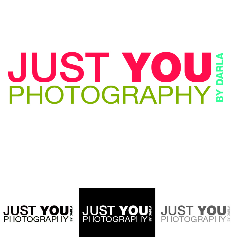
I need a logo design for my photography business, Just You Photography. Color is my main thing. The color scheme I'm interested in includes: bright orange/red, a red that is vibrantly more in the pink family than orange, purple, avocado green, and turquoise. Not all of these colors have to be included in the design, but are a part of my company branding. I like a style that is a little hippie/bohemian/gypsy that communicate a sense of free spirit. Not all my clients are women, so I don't want anything overtly girlie, such as hearts, flowers, etc.
Mises à jour
I am realizing I need to provide more detail if I want you to be able to interpret my style! Hard to imagine that you can't read my mind :)
Added Wednesday, August 29, 2012
This has really been a process for me in discovering that what I want does not always translate into what fits my needs. A huge thank you to all of you who have patiently worked at interpreting my vision for me. Each of you has helped me sort out my desires vs. my needs in one way or another. I think I have a few pointers that will help as we close in on the deadline.
1. I've decided to eliminate 'by Darla'. It leaves it less cluttered and simple.
2. I use my logo like a signature on the images I post on FB and in books and albums I design. It goes on wedding photos, family pictures, High School seniors, both male and female, and business head shots also male and female. I began to see that the "fun and funky" doesn't really lend itself for weddings or business men. The cute and sassy isn't going to fly on a male's image posted on FB. When I hand out my business card, I want it to translate as ageless and genderless. Those are all things I had not worked out in my head when this project began.
3. To accomplish #2...
-A text only logo is the direction I need to go. I love the cute cameras, flowers etc. and felt like they had to be pried from my grip in order to fit my needs :)
-The font is the main thing. Something clean and simple, but with a carefree and easy feel to it...flowy.
-The word "You" is the most important word in my logo. I want the Y capitalized. I am also good with the font size for "You" to be a bit bigger than "Just" if it adds to the design without making it stand out too much.
-Photography is the least important word, but still important. I don't want anyone not understanding the moment they see the logo, that it's a photography company.
-Color is huge. I like the darker, richer, jewel tones. I do not at all care for the softer colors. They do not translate genderless to me. No yellow or gold. If you use orange, please use one with a great deal of depth to it without any rust or brown in it. For the most part, the red has been interpreted very well. The blue I want is very similar to Design Crowd's logo icon. The shade is perfect, but needs to be more intense. The green has been the most difficult color to describe. I am realizing I am the ONLY one who pictures avocado green the way I do, LOL!, since ALL of you have used an almost identical shade. So here's what I did. (After I wrote everything before this). I went to kuler.abobe.com and created a color scheme bar of the colors I want. Wish I had know about this earlier, it would have saved us all a ton of mind reading. If you go to this link, http://kuler.adobe.com/#themes/search?term=favorite%20scarf, it should take you directly to my color bar called "favorite scarf". I don't think you need an account to see it, but if you do, it's easy to create one and it's free! If the link does not take you to my color scheme, you can just go to kuler.abobe.com, click on themes and type in 'favorite scarf' in the search bar.
Thanks again, everyone. You have an incredibly difficult job!!! You are to be commended on your creativity, your ability to interpret someone else's vision, and not only give them what they want but understand how that fits with their need. I have a much greater appreciation for you all through this process.
darla
Added Thursday, August 30, 2012
Marché(s) Cible(s)
Mainly High School seniors and families
Secteur / Type d'entité
Business
Texte du logo
Just You Photography by Darla
Styles de logo qui vous intéressent
Logo mot symbole
Logo (texte seulement)
Aspect
Chaque curseur illustre les caractéristiques de la marque client et le style que doit transmettre votre design de logo.