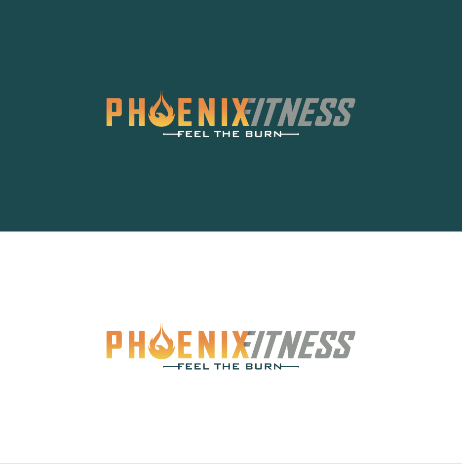
Upmarket Personal Fitness Trainer in need of a logo design

Vous souhaitez remporter un projet comme celui-ci ?
Ce client a reçu 30 designs de logo de la part de 15 designers. Il a choisi ce design de logo de WestleyDesign comme design gagnant.
Inscrivez-vous Trouvez des Projets de DesignBrief de Design de Logo
I am an Upmarket Personal Fitness Trainer currently operating in the UK.
I would like a bespoke logo design for my company which trades as
Phoenix Fitness
I would like a logo that can be used for the following
• Business stationary
• GYM wear
• Website (when finished)
• Company vehicle (medium sized van digitally printed)
• Client apparel
The company vehicle is being fully wrapped in digitally printed vinyl so I am not restricted to solid colours which enable gradients to be used in the logo design.
I would like to have the PHOENIX from my logo printed onto gym clothing like hoody’s and t-shirts for my clients to wear in and out of the gym so the design has to be a stylish and modern as clients wearing the branded apparel will be aged prominently in the 20 to 35 age range.
I have attached a very very very crudely cut and pasted mock logo which I very quickly put together for illustration purposes it is very very rough just to illustrate how I visualise the logo to look. Please feel free to change my extremely crude design after all that is why I am here.
I would also like a muscular chest factoring into the design as my crude design looks a bit 2Dimentional, I think it would look better positioned like the angle of the eagle in the attached example logo files. I have also attached some other artwork I like the look of for inspiration.
The company name is: Phoenix Fitness
The strap-line I would like to use is: Feel The Burn
In the logo design I would a flaming muscular Phoenix bird flexing its right arm which is circular to form the letter O in Phoenix.
Check list:
• Visually appealing to 20-35 age range, modern, trendy, professional.
• An outstanding bespoke emblem, that mirrors the bespoke one-on-one personal fitness programme tailored to each individual client which I provide
• The letter O of the word PHOENIX to be of the phoenix bird flexing its right arm. See attachment crude logo
• Muscle tone very defined in the arm on the phoenix to promote the increased muscle definition to be attained
• The head of the bird to be proportionately sized with muscular chest and arm
• FEEL THE BURN as a strap-line not to compete with the company
****I DO NOT WANT A TWO DIMENTIONAL PHOENIX AS ILLUSTRATED IN MY CRUDE EXAMPLE – I WOULD LIKE SOME DEPTH AND A CHEST INCLUDED IN THE DESIGN****
If you have any further questions please do not hesitate to ask and thank you for your time.
Adam
Phoenix Fitness
Mises à jour
New uploaded images attached to illustrate how I visualise the logo design.
Added Tuesday, May 27, 2014
Project Deadline Extended
Reason: need the logo to wok with a #1E535B background ..please re-submit .. cheers Adam
Added Sunday, June 08, 2014
Marché(s) Cible(s)
Males and Females aged 20 to 40 years of age
Secteur / Type d'entité
Fitness
Texte du logo
Phoenix Fitness / Feel The Burn
Styles de logo qui vous intéressent
Logo d'Enseigne
Logo contenu dans une forme
Logo pictural
Un objet réel (texte facultatif)
Logo de figurine
Logo avec illustration ou personnage
Aspect
Chaque curseur illustre les caractéristiques de la marque client et le style que doit transmettre votre design de logo.
Élégant
Audacieux
Léger
Sérieux
Traditionnel
Moderne
Sympathique
Professionnelle
Féminin
Masculin
Coloré
Conservateur
Économique
Haut de gamme
Exigences
Doit avoir
- be able to work on a #1E535B background