Redframe.com Redesign of Logo
Vous souhaitez remporter un projet comme celui-ci ?
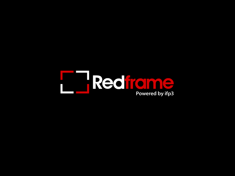
Ce client a reçu 283 designs de logo de la part de 74 designers. Il a choisi ce design de logo de Graphicsbox comme design gagnant.
Inscrivez-vous Trouvez des Projets de Design- Garanti
-
 US$400
-
 283 designs
-
 74 designers
Brief de Design de Logo
Redframe.com is a re-branding of our online website Content Management System at ifp3.com. Our product is a large departure from our old business model and with that we want a fresh new name and logo to accompany it. Our Clients are creative professionals (photographers, artist, designers, etc..) that want to show off their imagery in the best possible website setting. Our existing sites are created at http://ifp3.com. The new sites will be generated from http://www.redframe.com/. The Redframe site has a coming soon page and an example of our current Logo for Redframe. We like the logo but purchased it from a Royalty Free stock agency and realize hundreds of companies could be using this logo. We are looking for something unique that we won't have to worry that other companies might have. We intend to trademark this logo.
We need this logo to be able to be on a black background (such as on the redframe.com site now) and on light backgrounds (such as on - http://www.redframe.com/emails/RF-coming-soon.cfm). We are open to 2 versions of the logo to meet the above demands if the design warrants it. We also are not sold on the font we are using so please feel free to change that as well. Red, black, gray and white are our current color schemes in the logo and sites (sales site and administration area). We are open to suggestion though.
Our Logo also needs to temporarily have the text (powered by ifp3) put on it (in a subdued way - such as in our current logo). We can't alienate our existing ifp3 client base of thousands of clients. In 6 moths though we will drop this text from the logo.
Our current logo represents to us the red frame standing out from the masses of lesser (smaller) gray frames. Mainly what we want to convey is redframe standing out from the masses. But again we are open to your creative interpretations so you don't need to follow the 4 boxes formula of our existing logo. We really mainly want our logo to stand out and look "upscale".
Marché(s) Cible(s)
Photographers, artists, designers. Most of our clients are photographers but we are trying to expand beyond this market and be more "upscale" lookin.
Secteur / Type d'entité
Business
Texte du logo
Redframe
Styles de logo qui vous intéressent
Logo abstrait
Conceptuel / symbolique (texte facultatif)
Logo mot symbole
Logo (texte seulement)
Exigences
Doit avoir
- Must have "powered by ifp3" temporarily on the logo in a subdued way. We will eliminate this off the logo in 6 months. It must be legible enough for our existing clients to see it but not stand out as much as "Redframe". "ifp3" is always lower case as well (no capitals). "Redframe" or "RedFrame" is how we want text casing for the name.
Bien d'avoir
- We are open to a Wordmark logo but are leaning more towards and abstract logo with textual "RedFrame" name beside it. We also prefer the format of Logo to left and text to the right. It lends itself to our layouts better. But we are open to other ideas.