NUFIT Logo Redesign
Vous souhaitez remporter un projet comme celui-ci ?
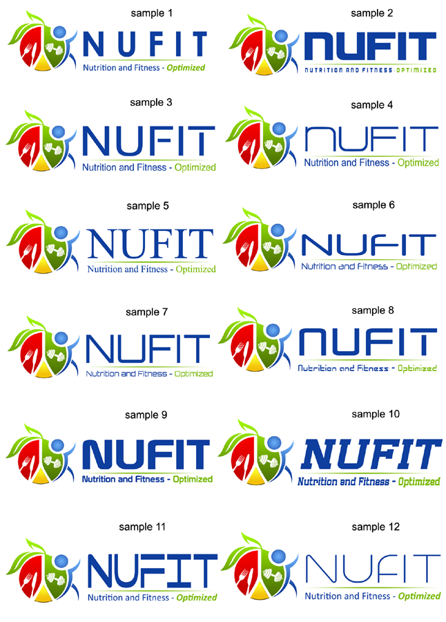
Ce client a reçu 21 designs de logo de la part de 11 designers. Il a choisi ce design de logo de DDR_design comme design gagnant.
Inscrivez-vous Trouvez des Projets de Design-
 A$200
A$200
-
 21 designs
-
 11 designers
Brief de Design de Logo
Hello. Im looking to redesign my business logo and what my business stands for. My business name is NUFIT and I run a Modern Sports Nutrition consultation business however i have now moved into small group training additionally. Please have the design a little more focused on Nutritional aspects but still have the training aspect there too, if that makes sense.
My website for more info is here: www.nufit.com.au
Basically I want my design to be CLEAN, SIMPLE, FUN, PROFESSIONAL and represent what NUFIT stands for. The design must be universal, appealing to all age groups.
I want the writing of NUFIT to be CLEAN and CLEAR please.
Additionally id also like the sub heading to read "Nutrition and Fitness. Optimized"
I have uploaded my rough design. I do like my concept however you guys are the professionals and know what looks good!
Thanks in advance for your creative and hard work!
Mises à jour
Just to clarify; In the design I have drawn, the "circle" with the red,yellow and green represents a PLATE.
The RED represents animal protein or MEATS
The YELLOW represents FATS
The GREEN represents VEGETABLES
The BLUE circle which is the "Head" actually doubles as a glass of water.
The designs are awesome so far!
Added Saturday, May 03, 2014
Secteur / Type d'entité
Training
Texte du logo
NUFIT Nutrition and Fitness. Optimized.
_brief012200.png?AWSAccessKeyId=ASIARQT47ZIU52MVM5PR&Expires=1761461226&response-content-disposition=attachment%3Bfilename%3D%22Screenshot%20%285%29%20Thursday%2C%2001%20May%202014%2003_22_00.png%22&x-amz-security-token=IQoJb3JpZ2luX2VjELL%2F%2F%2F%2F%2F%2F%2F%2F%2F%2FwEaCXVzLWVhc3QtMSJHMEUCIQCzl8tGk%2BeNqpLhu6naz4fUhBLEkWQK04OGJmE%2FKaXugQIgR2XNBgVUbzlJsOMnY%2B4e82nzVMlu6Zt2699p1fF3GFcq6wMIaxAAGgwxMDQ0MTUwODcxNDUiDCQZ50PbCtqNTGYCjCrIA5wHcUz4cwwImxP5%2F0PFRCLX2qsul1FuXrw9oJ%2FOahhNrbzuhFHDW7iGSBSgUbC1sOwtKw5ltcbreCbFdPMLDXwQVP4dChf1C6QGg9xS9NZw9w6gLs3D7By6W7rLRVILyLdXRjLtog0mwz2HllO1AVZ8tiHwA7YAddeLxwBLawgf7jWxzCrgBwOkfyEzqkxDBIurGAiQh7DuLjK76aMbG3qLm3Oc2YFB4ruOl5Wl04aeXbxwEZKGNqaCeDFLmrWGcnXF2z1w8hUYUUF6saf%2F%2FNyaMfsd322faPQvIctYf5%2FK%2BH7W17dTd6WIzZBrFW7EFUgdGX3D6bL0MqTbqEXPjFde9NfSwbJWAV4K4Xw5C%2Fy2nq6pkKh4okBDG1fimjzpS9MU7xdUH77mxBwkwD0O56HHMmqM0NVpauPWnqTCTD4MFh5x4WhXJlg%2BoRC2EFHwOo4RjavvTs8HB3djJvu8yBoX1Y4aHT40mQvSY1n%2B8O5bEmiAUcgjCqYanzl1ByMaN%2FyUX2Fn2k9yBFW1S7cdykwL%2B20wX2AQliUjqGcJpuB6hUrzuGQ3lbTdimtdMBIONXmVIMyiy5kMQf3983HCHsS5ORNfZVnJzTDZ2%2FDHBjqlAabaXnTLsJ5WX5EQo%2BDsvTjdKe1xu2nhguqbCyZ2aY98N55vxzQDa5XK2Rz2WxlcWicYXu%2B2mqjWI%2FuNeXN4HCO%2B27UxaYt1UZZ%2FzJ8MDMTrVTn%2BKc7b3ZQyQfD43Dy0sSTyOHPnohmNt%2BE4QSP3uU7KVv%2BqkAZ6VmUQW9IUvM0gnkfxwdSBISrSGgJRko7FAtPW%2F05kiv6uC%2FoF8j%2Ba7s1pkWVN1A%3D%3D&Signature=5AfpYa%2BHkgaqAcYWVkZkC%2Fuyc38%3D)