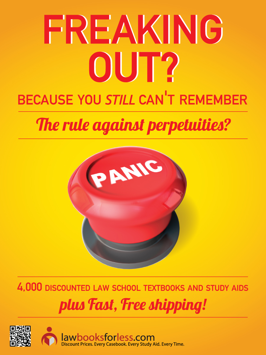
Law Student Bookstore Sales Promotional Poster
Vous souhaitez remporter un projet comme celui-ci ?
Ce client a reçu 74 designs de Poster de la part de 17 designers. Il a choisi ce design de poster de Alex comme design gagnant.
Inscrivez-vous Trouvez des Projets de Design- Garanti
-
 US$140
-
 74 designs
-
 17 designers
Brief de Design de Poster
We need a design for a 18"w by 24" high poster (to be printed on Sintra Board).
The poster will be displayed in U.S. law schools and will promote our online law school bookstore LawBooksForLess.com.
Our audience is usually aged 21-26 years old, and we need to design a poster that will both be "fun and creative" and also be very eye-catching.
We have already "roughed up" a design with appropriate text and graphics and for this project, but we need this design polished. We have uploaded a .zip file which contains:
-Two "rough versions" of our poster
-QR Code graphic
-Our LawBooksForLess.com Logo
-Panic Button graphic
We are asking for designers to submit designs utilizing the text and artwork (panic button, logo, etc.) that appear in the rough design in re-creating a new, more-polished design. Otherwise you may use whatever background, font and other design elements you desire. It must have primary elements that are large enough (main title text and graphic) to attract attention from a distance.
Mises à jour
7/12/2012: Added EPS files of our logo to project for greater designer flexibility. Two versions, one with tagline, one without.
Added Thursday, July 12, 2012
Thanks for all of the submissions so far. Unfortunately, none of the submitted designs as of this writing have really won us over yet. Many seem too "busy" with the text and graphics crammed in in such a way as to make it difficult to take in the information provided. In some ways, simply taking the rough designs initially provided and improving on the font and text placement will work without adding additional elements would work. Trying to get "too creative" with overly exotic fonts, backgrounds and additional graphic elements, while inventive, tends to clutter up the design bury our message and not attract the attention of the passerby.
Added Sunday, July 15, 2012
Project Deadline Extended
Reason: To accommodate requested revisions from specific designers. If we have specifically requested a revision from you, please provide it by Wednesday, July 25th as we cannot extend the deadline further.
Added Tuesday, July 24, 2012
Thanks to everyone who participated. It was a difficult decision deciding between the final few designs which involved a number of peoples opinions here, but we have made our decision and we thank you for submitting and apologize if your design was not ultimately chosen.
Added Tuesday, July 24, 2012
Marché(s) Cible(s)
Law students (male/female, aged 22-26 years old)
Secteur / Type d'entité
School
Aspect
Chaque curseur illustre les caractéristiques de la marque client et le style que doit transmettre votre design de logo.
Élégant
Audacieux
Léger
Sérieux
Traditionnel
Moderne
Sympathique
Professionnelle
Féminin
Masculin
Coloré
Conservateur
Économique
Haut de gamme
Exigences
Doit avoir
- Must use the Panic Button artwork, our logo artwork and QR code graphic.
-
Must contain the following MAIN title text:
Freaking Out? Because you still can't remember The Rule Against Perpetuities?
-
Must contain the following ancillary text:
4,000 discounted law school textbooks and study aids, plus Fast, Free Shipping.
-
It must have primary elements (i.e. the main title text and the Panic Button graphic) that are large enough to attract attention from a distance. Maintaining the font or white background from the rough design is NOT important- you can use your own font or background.
Bien d'avoir
- Additional optional text:
Get 1% back in LawRewards.
-
Other backgrounds, graphics, etc. that will not detract from the main Panic Button graphic.