MrShave.com.au website design
Vous souhaitez remporter un projet comme celui-ci ?
Ce client a reçu 36 web designs de la part de 8 designers. Il a choisi ce web design de the-lion-king comme design gagnant.
Inscrivez-vous Trouvez des Projets de Design- Garanti
-
 A$670
A$670
-
 36 designs
-
 8 designers
Brief de Web Design
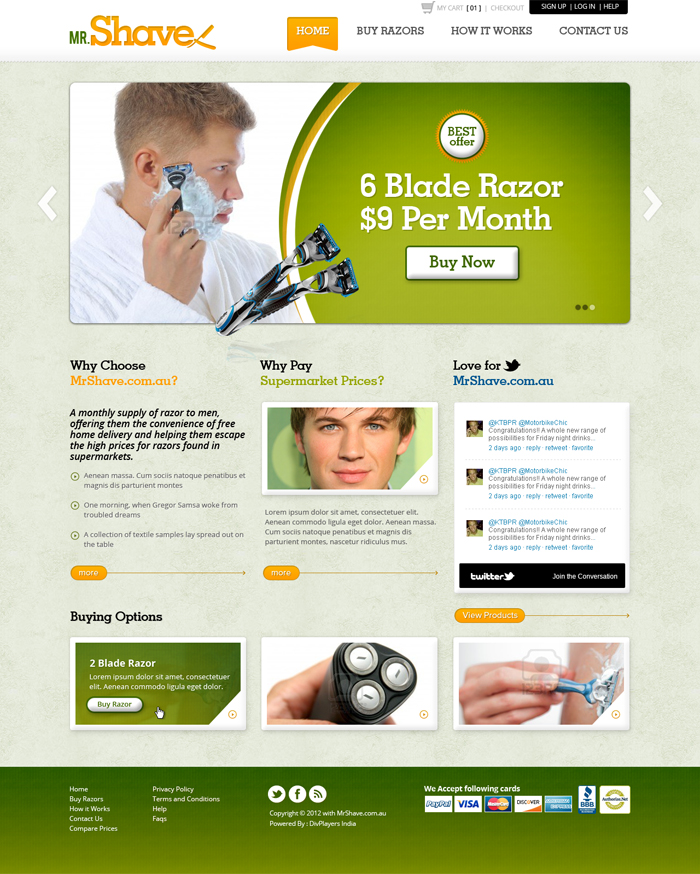
MrShave.com.au is a new Australian website selling a monthly supply of razors to men, offering them the convenience of free home delivery and helping them escape the high prices for razors found in supermarkets.
We need a home page as per the details listed below, and the winner will need to design additional pages (a few static pages, product page and checkout page) which will hopefully be easy once the theme on the home page is established
- Home page design that utilises best practice user experience design, intelligent colour theory and colour scheme and a design that achieves the goals of the home page
- The goal of the home page is to communicate how the site works/whats on offer, and convince consumers to buy
- logo
- navigation menu (Home, Buy razors, how it works, contact us)
- Small nav sub-menu (Sign up, Log in, Help)
- three main panels showing three main buying options (2 blade razor $5 per month, 4 blade razor $7 per month, 6 blade razor $9 per month)
- Three sub-panels (Why choose MrShave.com.au?, Love for MrShave.com.au - twitter plugin showing tweets from MrShave, Why pay supermarket prices? See how MrShave stacks up)
- Footer containing nav menu items + FAQ + Compare prices + Terms and conditions + Privacy Policy, Copyright info, Website security logos and info)
Marché(s) Cible(s)
Men aged 18-60
Secteur / Type d'entité
Security
Aspect
Chaque curseur illustre les caractéristiques de la marque client et le style que doit transmettre votre design de logo.
Élégant
Audacieux
Léger
Sérieux
Traditionnel
Moderne
Sympathique
Professionnelle
Féminin
Masculin
Coloré
Conservateur
Économique
Haut de gamme
Exigences
Doit avoir
- - Symmetry
- Key info must be above the fold
- Be innovative and really consider how this website will stand out and highlight the key features to consumers
Bien d'avoir
- - Textures are sometimes good
- Maybe the main buying option panels are greyed out and then upon rollover they go to full colour and/or enlarge to highlight the offer in consumers minds?
- Maybe the three main buying option panels are part of a rotating banner?
Ne doit pas comporter
- - Ugly fonts (serif fonts are usually this)