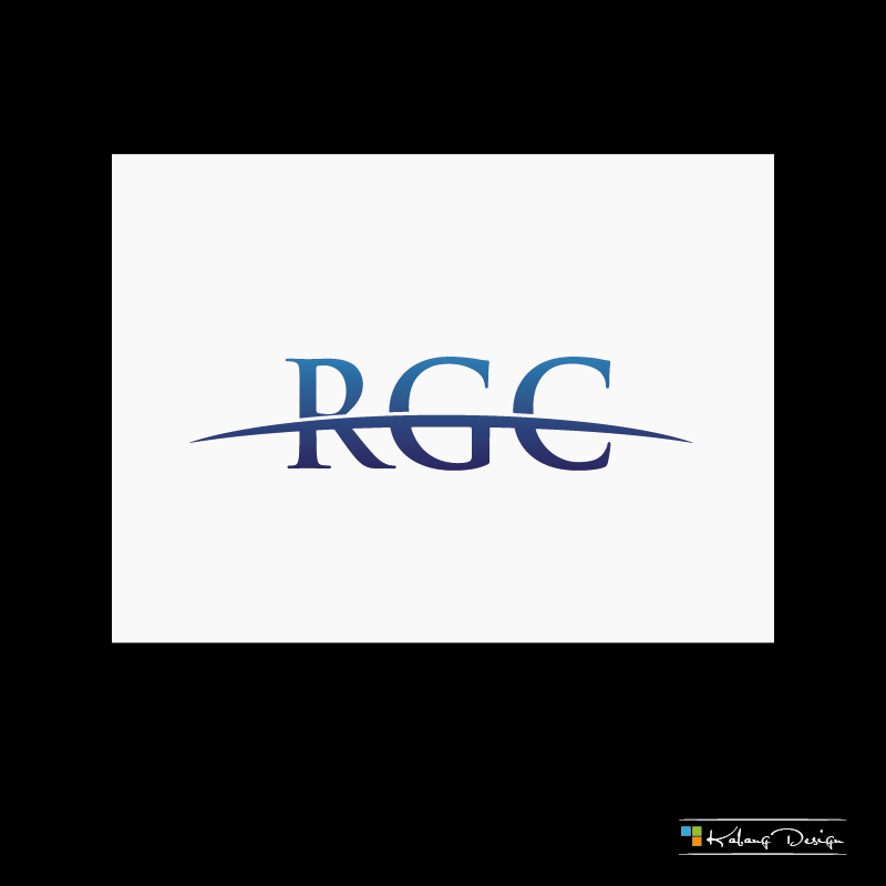
Multi-practice Consulting Company Needs Logo Redesign

Vous souhaitez remporter un projet comme celui-ci ?
Ce client a reçu 127 designs de logo de la part de 14 designers. Il a choisi ce design de logo de SychoUno comme design gagnant.
Inscrivez-vous Trouvez des Projets de Design- Garanti
Brief de Design de Logo
We need a logo redesign for a start-up consulting company called 'RedGalaxy Consulting'. We started out as an Oracle-oriented company with human capital and strategic management expertise but have now added multiple practices, including an SAP practice as well as a Cloud Computing Salesforce.com practice.
Our original color motif is red/black (Oracle red), which doesn't fit well with SAP blue nor Salesforce white/blue. And it looks like it was created during the 90's so we need a more 'modern' look. We would like your help in reinventing our logo/brand and positioning ourselves as a transformational, modern company ready to leverage our decades of experience along with cutting-edge technology to help solve client needs.
*** The Ideal design incorporates as base colors Blue, White, and red (probably in that order of importance), which covers all of the colors of Salesforce, Oracle, SAP. In general, a lighter-themed logo is probably ideal. Regardless of color, the final design should look stylish and professional and the logo should be able to easily integrate itself with most modern powerpoint presentations (white/light background). I have attached a sample powerpoint that this logo should be able to fit with as well as some examples of where a logo may be placed. The final logo can be any of those sizes, we can adjust accordingly.
Current website:
http://www.redgalaxyconsulting.com/
Current listing on Salesforce AppExchange:
https://appexchange.salesforce.com/listingDetail?listingId=a0N3000000B50jmEAB
Note:
Priority 1:
*** This is VERY IMPORTANT - Please DO NOT utilize large amounts of the color "red" due to the name “Red”Galaxy. To clarify, a final design with 1% red may be acceptable. So far, most of the designs are ~25%+ red/black and very few of them will work with a white/blue powerpoint. Feel free to think of the company as "Galaxy Consulting", do not let the "Red" overtly influence your design.
Please review the attached powerpoint - The logo we want MUST be able to fit in a powerpoint like this, either on a title page by itself, as a banner logo on top or as a smaller logo on the bottom in the corner.
* No need to have the logo compatible with the current website - the site can be redesigned around the logo and this logo is primarily for powerpoint presentations, flyers, etc.
* For the wording, just "RedGalaxy Consulting" is fine, no need to add "Group"
Competitor logos (for example):
CapGemini:
http://www.capgemini.com/sites/all/themes/capgemini/logo.png
Accenture:
https://appexchange.salesforce.com/servlet/servlet.FileDownload?file=00P3000000GAd9vEAD
Deloitte:
http://www.deloitte.com/deloitte-ecm-cm-dpm-web/images/dcom/new_deloitte_logo.gif
All of the example competitor logos 'work' in a regular white powerpoint. We need a logo that does the same, if not better.
Mises à jour
Updated with additional comments, uploaded another sample picture
showing how the current image is too red and does not work very well
with white/light backgrounds and we need one that does.
Added Friday, March 21, 2014
Updated brief with some minor changes and additional details. 90%+ of all submissions so far use the Red/Black color combination and are likely too dark and heavy. It is possible this can work but I would prefer to see some that utilize mostly Blue/White with just a tiny bit of red (i.e. stylistically, more like Salesforce and less like Oracle)
Added Friday, March 21, 2014
Additional powerpoint example uploaded!Will generate additional feedback on the logo reviews after consulting with additional people. Thanks for the submissions so far!
Added Saturday, March 22, 2014
Project Deadline Extended
Reason: Providing more time over the weekend for some late designers to be able to submit their work!
Added Thursday, March 27, 2014
Marché(s) Cible(s)
Executive/corporate customers based in the US. CxO's of companies, Directors, etc.
Secteur / Type d'entité
It Company
Texte du logo
RedGalaxy Consulting
Styles de logo qui vous intéressent
Logo pictural
Un objet réel (texte facultatif)
Couleurs
Couleurs choisies par le client et à utiliser dans le design de logo:
Aspect
Chaque curseur illustre les caractéristiques de la marque client et le style que doit transmettre votre design de logo.
Élégant
Audacieux
Léger
Sérieux
Traditionnel
Moderne
Sympathique
Professionnelle
Féminin
Masculin
Coloré
Conservateur
Économique
Haut de gamme
Exigences
Doit avoir
- Modern, Professional.
Logo MUST be able to fit in with modern, light-themed corporate presentations.
Please review the attached file: BadLogo in Powerpoint.png
The logo we want MUST be able to fit in a powerpoint like this, either on a title page by itself, as a banner logo on top or as a smaller logo on the bottom in the corner.
Ne doit pas comporter
- Fonts: No real preference other than to keep it corporate and professional.
Please DO NOT include too much "Red" unless you are very confident such a logo will work well, stylistically, with predominantly white/blue powerpoint presentations.
Note: Should not create a logo similar to current logo's. Those are NOT preferred design.