

 Rafraîchir
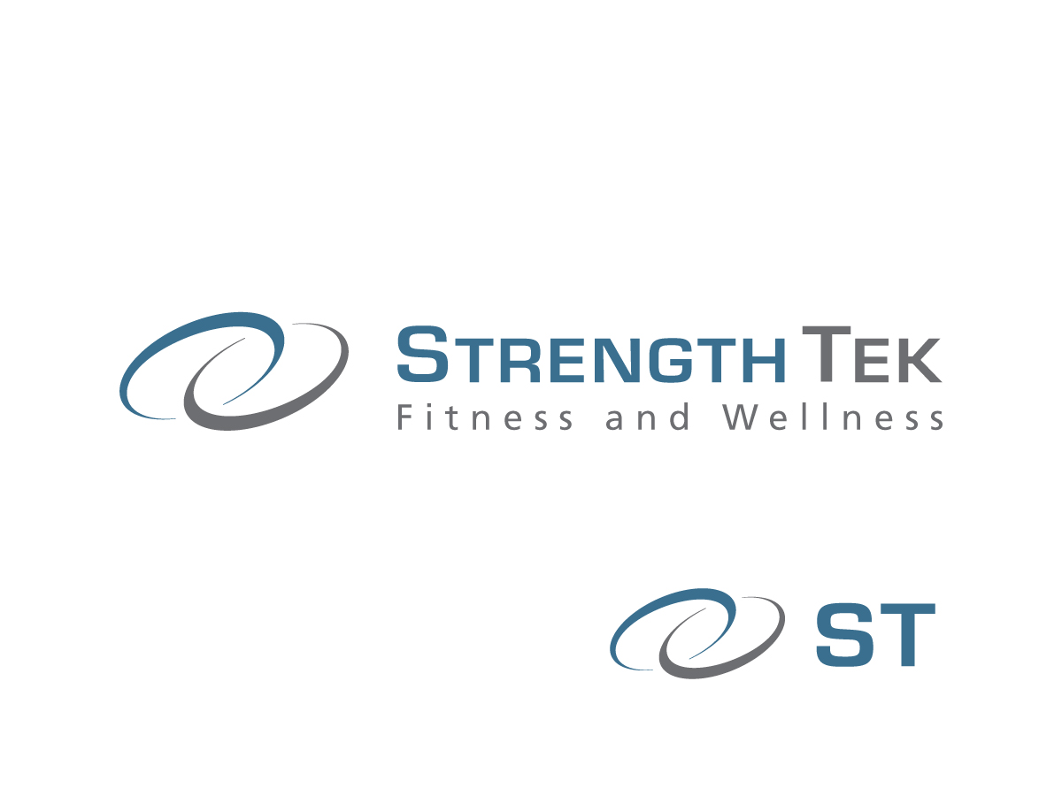
Strength Tek Logo
Vous souhaitez remporter un projet comme celui-ci ?
Ce client a reçu 121 designs de logo de la part de 22 designers. Il a choisi ce design de logo de Studio G5d comme design gagnant.
Inscrivez-vous Trouvez des Projets de Design
- Garanti
-
 US$170
-
 121 designs
-
 22 designers
Brief de Design de Logo
We need an updated, timely logo designed to better reflect our business in today’s and future markets.
Established in 1987, Strength Tek is a Canadian workplace fitness and wellness company specializing in onsite fitness centre management and workplace wellness programs and services. We service both the federal government and the private sector, with clients located across North America.
Our professional and highly skilled staff are committed to making a difference in the lives of each individual, thereby strengthening organizations as a whole.
Key messages to communicate in the logo
We want our logo to communicate that we partner with organizations, delivering employee fitness and wellness services that support organizations to succeed.
Logo should reflect relationships and movement, keeping in mind the corporate target audience.
- Movement can reflect growth, reaching goals, success.
Marché(s) Cible(s)
Marketing to businesses and decision makers within organizations (CEOs, human resources, property management, etc.)
Texte du logo
Strength Tek
Styles de logo qui vous intéressent
Logo d'Enseigne
Logo contenu dans une forme
Logo abstrait
Conceptuel / symbolique (texte facultatif)

Logo mot symbole
Logo (texte seulement)
Logo de Lettermark
Acronyme ou logo texte (texte seulement)

Aspect
Chaque curseur illustre les caractéristiques de la marque client et le style que doit transmettre votre design de logo.
Élégant
Audacieux
Léger
Sérieux
Traditionnel
Moderne
Sympathique
Professionnelle
Féminin
Masculin
Coloré
Conservateur
Économique
Haut de gamme
Exigences
Doit avoir
- The design must be horizontal orientation, with the Strength Tek name on the bottom, or to the right of the graphic, if incorporating one.
- Font should be professional/corporate.
- Company name should be either Strength Tek or STRENGTH TEK. The font in both words in the company name must have equal visual weight; "Tek" should not be highlighted/bolded).
Bien d'avoir
- A logo that has a graphic element with our full company name and that same graphic can be used with just the acronym (ST).
Ne doit pas comporter
- Should not look like a logo for a public/community gym
- Prefer not to have a graphic element that closely resembles a person, fitness equipment. Prefer a abstract representations.