Banner Ad Design Project
Vous souhaitez remporter un projet comme celui-ci ?
Ce client a reçu 6 designs de bannière de la part de 4 designers. Il a choisi ce design de bannière de TheyCallMeJenks comme design gagnant.
Inscrivez-vous Trouvez des Projets de Design-
 US$210
-
 6 designs
-
 4 designers
Brief de Design de Bannière
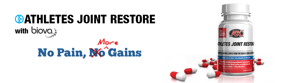
We need a banner created that is 1950px x 550px. This will be a very clean yet high attention to detail. The design that will look very similar to this....
http://cloud.smashbrand.com/1H371U3p2w3o2V2O3V1x
This is for a joint health product. We will say the following in the banner advertisement and here is a quick wire mockup.
http://cloud.smashbrand.com/3Y300T052M3G2b0T1K0Q
Introducing Athletes Joint Restore
with BiovaFlex (biovaflex logo)
Protects & repairs joints from the wear & tear of exercise.
TAGLINE: No Pain, More Gain However we are playing on the phrase "no pain, no gain", so we would have " no pain, no gain" with the no crossed out and the word more inserted. This should be very clear that we are crossing out the word no and inserting the word more in a traditional handwriting font like the wire mockup.
Finally the bottle image with some pills next to the bottle that seems natural with correct shadows applied. It is critical the graphic must have attention to detail like shadows on the images that look natural.
Attached is an asset pack that includes the product image, the product name font, biovaflex font, and an image of a pill that can be used to re-create pills laying next to the bottle.
Download link for the project assets: http://cloud.smashbrand.com/3q1H0K1R0r2r1R3L040d
Download link for images of the pills: http://cloud.smashbrand.com/3H1p2S3e301r0b21260t
Thanks and good luck and it must include the PSD as it may need to be slightly tweaked on our end when merging into their new site home page which you can preview here: http://preview.smashbrand.com/ax/ The current black banner style is out, and will be replaced with the winning design, going with a clean and modern look. Example product page here: http://preview.smashbrand.com/ax/mockup/product.php
Mises à jour
Guys, the quick wire I made was all black and white. You don't have to make it look exactly like my wire. Make the tagline larger and be creative with it. Use some color. Here is a link to an AI file with the brands other colors.
Added Monday, May 21, 2012
Marché(s) Cible(s)
Males in the fitness and workout market
Secteur / Type d'entité
Health
Aspect
Chaque curseur illustre les caractéristiques de la marque client et le style que doit transmettre votre design de logo.