Website Re-Design and Refresh

Vous souhaitez remporter un projet comme celui-ci ?
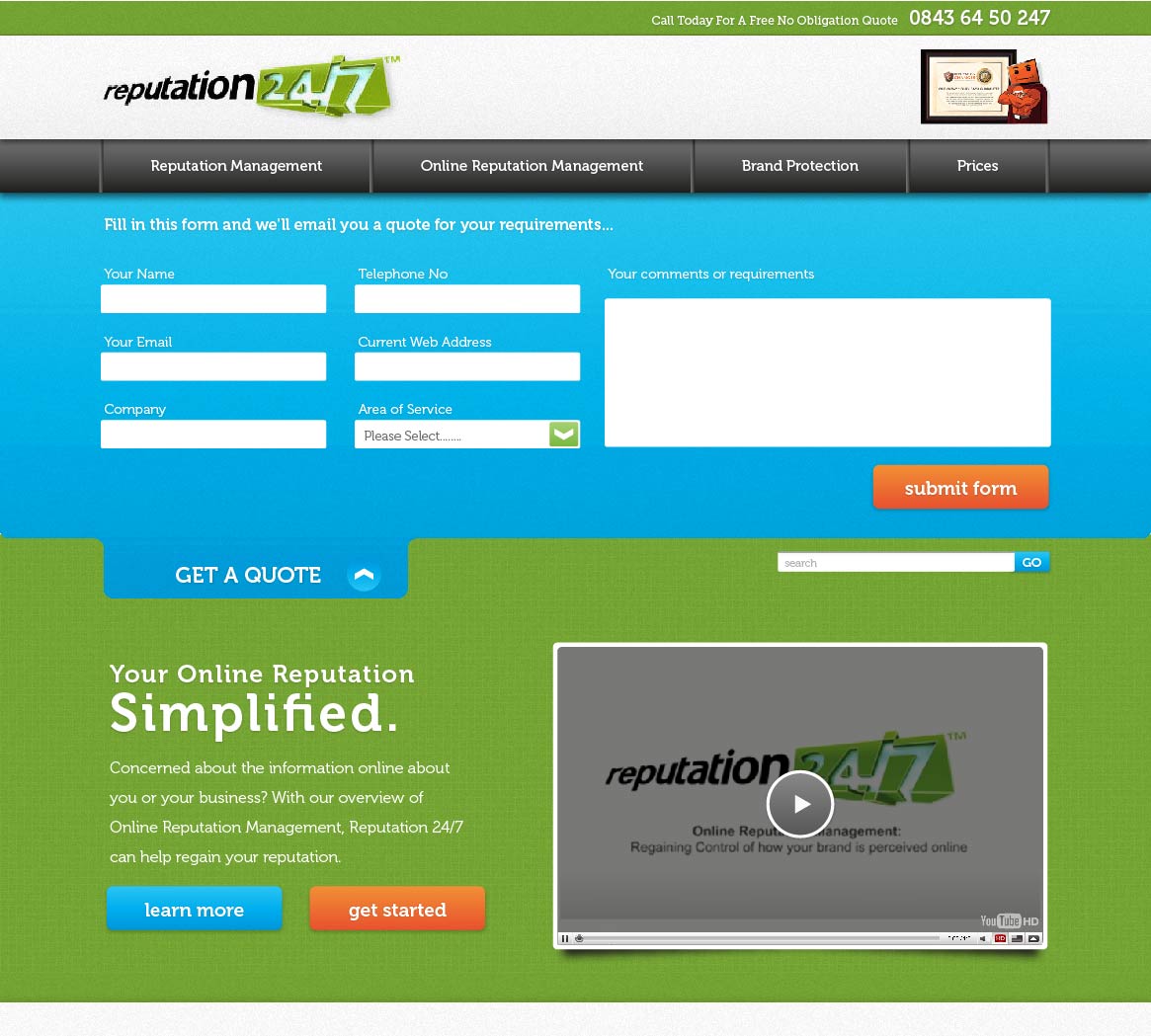
Ce client a reçu 61 web designs de la part de 18 designers. Il a choisi ce web design de His-P Design Studio comme design gagnant.
Inscrivez-vous Trouvez des Projets de Design- Garanti
Brief de Web Design
We are looking for a redesign of www.reputation247.com the deliverable is a graphic which will be used as a template for the main site.
The Logo will remain the same
The Video currently shown must be included in your submission
Search Element must be included, this should be better visible than it is currently
All navigation current on the left is to be moved to the right.
Top left column should be a “Quick Quotation” element. It should stand out and draw the eye as that is the conversion that we aim for on our site. This is the purpose of the site to attract these.
Add Testimonials navigation that users can click upon.
Below this element on the right “Recent Posts” should become Latest News”
We want users to see how much press coverage the site has had, the following UK’s news logos should be used Times, Daily Mail, BBC and The Independent.
Please use the current text from our site but make some main features which we want to draw attention to. 5 points and use fake text, using a bullet point, icon, graphic or colour to make it stick out the most.
Large Guarantee, shown through a Seal graphic. An example of this type of style is attached.
Mises à jour
Please note that as per the brief we want to havenews/contact forms down the left hand side of the page. This is to comply with “F”shapeeye pattern which shows that users look mostly on the left of webpages.
Please make the quick quotes more distinctive and use of thefields suggested in the brief.
As you appear to like using vivid colours, please see thefollowing examples we like of vivid colours.
http://media.phonehouse.com/cpw-sales/static/images/common/global_nav/nnp_03.png
http://media.phonehouse.com/cpw-sales/static/sections/homepage/2012_04/images/ban_big_promises.png
http://media.phonehouse.com/cpw-sales/static/sections/upgrades/images/sidebanner_payg_upgrades.gif
Added Tuesday, May 22, 2012
Project Deadline Extended
Reason: The designs are not fulfilling all the points on the brief
Added Thursday, June 07, 2012
Pleaseamend your designs so that they adhere to the following:
Thereis a quick quotation form, as per brief, next to the video positionedon the left, the video on the right so they are the first items the userssee.
The"seal" guarantee should be top right and
Newsand Testimonials should be on the right hand side
Inthe main content text area please use latin ipsom lorem text and put 5 bulletpoints in large writing and latin below. Such as:
Lorem Ipsum
Lorem Ipsum
Lorem Ipsum
Lorem Ipsum
Lorem Ipsum
Lorem Ipsum is simply dummy text ofthe printing and typesetting industry. Lorem Ipsum has been the industry'sstandard dummy text ever since the 1500s, when an unknown printer took a galleyof type and scrambled it to make a type specimen book. It has survived not onlyfive centuries, but also the leap into electronic typesetting, remainingessentially unchanged. It was popularised in the 1960s with the release ofLetraset sheets containing Lorem Ipsum passages, and more recently with desktoppublishing software like Aldus PageMaker including versions of Lorem Ipsum.
Added Thursday, June 07, 2012
The following design is a good indication of style and the use of bright colors. Although the positioning of some elements is not as per the brief.
Added Monday, June 11, 2012

Added Tuesday, June 12, 2012
Marché(s) Cible(s)
Business To Business
Secteur / Type d'entité
News
Aspect
Chaque curseur illustre les caractéristiques de la marque client et le style que doit transmettre votre design de logo.
Élégant
Audacieux
Léger
Sérieux
Traditionnel
Moderne
Sympathique
Professionnelle
Féminin
Masculin
Coloré
Conservateur
Économique
Haut de gamme
Exigences
Doit avoir
- The Logo will remain the same
The Video currently shown must be included in your submission
Search Element must be included, this should be better visible than it is currently
All navigation current on the left is to be moved to the right.
Top right should be a “Quick Quotation” element. It should stand out and draw the eye as that is the conversion that we aim for on our site. This is the purpose of the site to attract these.
Add Testimonials navigation that users can click upon.
Below this element on the right “Recent Posts” should become Latest News”
We want users to see how much press coverage the site has had, the following UK’s news logos should be used Times, Daily Mail, BBC and The Independent.
Please use the current text from our site but make some main features which we want to draw attention to. 5 points and use fake text, using a bullet point, icon, graphic or colour to make it stick out the most.
Large Guarantee, shown through a Seal graphic. An example of this type of style is attached.