Logo Design for Quality Management Consultancy
Vous souhaitez remporter un projet comme celui-ci ?
Ce client a reçu 112 designs de logo de la part de 41 designers. Il a choisi ce design de logo de Alex Martin comme design gagnant.
Inscrivez-vous Trouvez des Projets de Design- Garanti
-
 £300
£300
-
 112 designs
-
 41 designers
Brief de Design de Logo
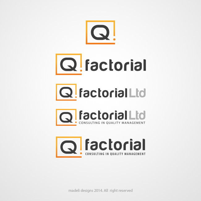
We need a logo design for a new company based in UK offering quality management consultancy services to an international client base. Our target market is technical / engineering / energy sectors, although our services are generic: developing, evaluating, auditing and advising on management systems. We have developed an initial style sheet and an idea for the logo based on the company name Qfactorial, represented by the mathematical expression Q!, meaning all the factors that multiply together to create Quality. We have also selected company colours and fonts. The attached Company Ethos and Style Sheet are provided as a guideline for the logo and (later) brand development.
Mises à jour
All designers please note: we need short "Q!", medium "Qfactorial" and long "Qfactorial Ltd - Consulting in Quality Management" variations on the logo.
Added Wednesday, February 19, 2014
Added Thursday, February 20, 2014
Hi Everyone, many thanks for all your designs - there is some really strong competition. We are holding a review meeting today to create a short-list of the designs we consider to have the greatest potential. Specific feedback will be provided to the short-listed designers, including any suggestions for refinement before the deadline on 1st March.
Added Sunday, February 23, 2014
Apologies to all designers for delayed feedback - we have been overwhelmed with the response this last few days. We are working hard to get back to you with specific feedback today. Thanks for your patience.
Added Wednesday, February 26, 2014
As we are working through the design review process, it is becoming clear that merging the Q and ! symbols by using the ! as the tail of the Q is generally not working. This is a surprise to us as it was the first thing we thought of before bringing the project to DesignCrowd. So far, they have all looked like baseball bats, policeman's truncheons, the Apple Shutdown icon inverted, or the Indesit logo inverted:)
Added Wednesday, February 26, 2014
Hi everybody, thanks again for a great response. We have been flooded with more good ideas and quick replies to our queries and suggestions. As of last night we had reduced the list to just 10 designs, but that number has tripled during the course of today. With the deadline only 2 days away we now have to be ruthless in our elimination. We will not have time to give detailed comments or explanation during the next round, so if your design is eliminated let us say, here and now, thanks for all the effort and creativity. We will definitely use DesignCrowd for any future logo project. It's been an absolute pleasure working with you all. If you want to see the winning logo, it will of course be featured on our website www.Qfactorial.co.uk scheduled to be launched on 01-April-2014.
Added Thursday, February 27, 2014
Secteur / Type d'entité
Auditing
Texte du logo
Short version: Q! Long version: Qfactorial Ltd - Consulting in Quality Management
Styles de logo qui vous intéressent
Logo pictural
Un objet réel (texte facultatif)
Logo abstrait
Conceptuel / symbolique (texte facultatif)
Logo mot symbole
Logo (texte seulement)
Logo de Lettermark
Acronyme ou logo texte (texte seulement)
Aspect
Chaque curseur illustre les caractéristiques de la marque client et le style que doit transmettre votre design de logo.