The Loop: Logo Design for new alternative media hub
Vous souhaitez remporter un projet comme celui-ci ?
Ce client a reçu 112 designs de logo de la part de 41 designers. Il a choisi ce design de logo de Raoul Camion comme design gagnant.
Inscrivez-vous Trouvez des Projets de Design-
 US$400
-
 112 designs
-
 41 designers
Brief de Design de Logo
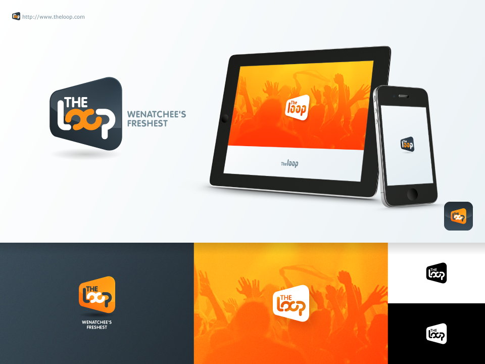
We are in search of a logo for a new media company based in Washington State called "The Loop" that will provide an entertaining, irreverent but reliable spin on local happenings. It will have an online presence primarily, but may later branch into print and broadcast.
The logo should include the words "The Loop" and be presentable with and without the tagline, "Wenatchee's Freshest" The color palette is open, but we tend to like designs in the red-orange-yellow spectrum. It should communicate fresh, modern and fun. Sophistication without stuffiness. Friendly and approachable. Trustworthy and smart.
We need versions that will work both on a white background (see the attached web page mockup as an example of how it might be presented) as well with an opaque background that will allow it to be applied over photos of varying contrast.
Mises à jour
Greetings Designers,
Added Monday, February 17, 2014
We are seeing a lot of text-based designs, which is appropriate, but we would also like to have an iconic element in addition to "The Loop", something that can be separated from the words and recognizable on its own, and that can be adapted as a "favicon" - the square images that pop up alongside URL addresses or Facebook postings. In some cases that might be the graphic treatment of the two "oo"s in the middle of "Loop," or it might be a completely separate icon situated above, below or beside the text.
Added Wednesday, February 19, 2014
Some great designs coming in. Just a few days left. Here are a couple more bits of inspiration that might help generate some new ideas: Wenatchee bills itself as "The Apple Capital of the World" so there might be a way to play with the apple, or to introduce the green palette with the reds - just not too literal. Also, The Loop takes its name from the 10-mile long Loop Trail that crosses over the Columbia River in two spots - so a river element might be introduced (again, not too literal). Thank you designers! Amazing work!
Added Wednesday, February 26, 2014
NO eyeballs or smiley faces please. Thanks!
Added Wednesday, February 26, 2014
Project Deadline Extended
Reason: We're going to give this one more week and then make a final decision. We're still hoping to find a few options that incorporate NOT an infinity loop in the middle of the design, but something more like an UNCLOSED infinity loop, or a figure eight on it's side that isn't closed in the middle. Also hoping for more options with three-dimensional depth to them and great stand-alone icons that can be pulled out of them. The apple and the river can be part fo the inspiration, but only in abstract ways. PLEASE feel free to incorporate your own color preferences/ideas.
Added Friday, February 28, 2014
Secteur / Type d'entité
Media
Texte du logo
The Loop (with removable tagline Wenatchee's Freshest)