

 Rafraîchir
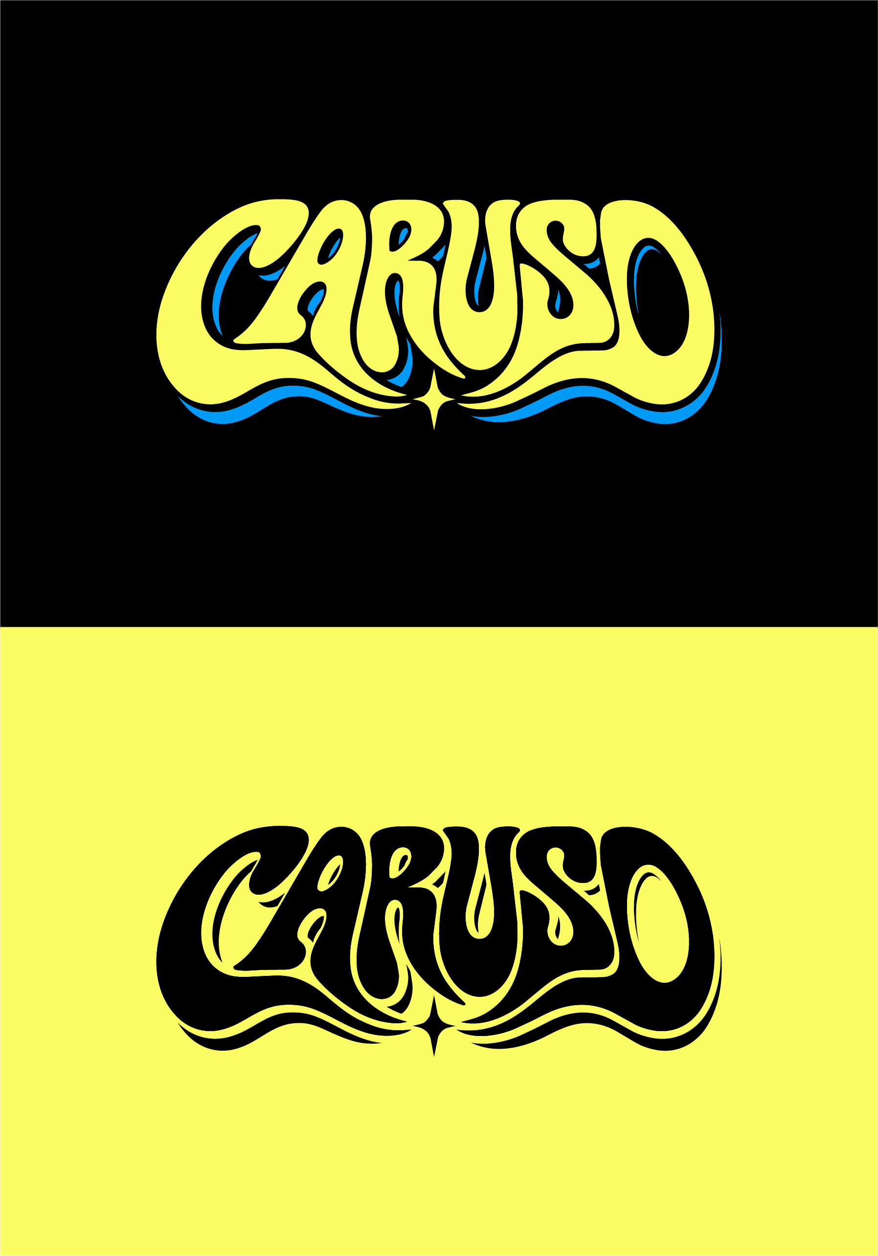
Custom Logo Design for Indie Rock Band - CARUSO
Vous souhaitez remporter un projet comme celui-ci ?
Ce client a reçu 248 designs graphiques de la part de 89 designers. Il a choisi ce design graphique de sumdes comme design gagnant.
Inscrivez-vous Trouvez des Projets de Design
- Garanti
-
 A$190
-
 248 designs
-
 89 designers
Brief de Design Graphique
I’m looking for a creative designer to help develop an original and distinctive logo/ Typography for my indie / alternative rock band, CARUSO.
Our music is a mix of indie rock, alternative rock and psychedelic influences, and I’d love for the logo to reflect that kind of sound and personality.
I’m looking for something bold, recognisable and memorable, with a bit of character and individuality. Ideally, something simplistic that i can use as a silhouette for other album covers over time with different patterns/ colours ect.
Creative Direction & Inspiration:
I’m particularly drawn to bold, iconic typography and vintage/retro psychedelic rock aesthetics.
I’ve attached a couple of reference images that capture some of the styles and lettering I really like. I love the expressive typography, interesting shapes, strong colour combinations and overall vintage feel. But OPEN TO OTHER CREATIVE IDEAS
Some directions I’d be interested in exploring include:
Bold, distinctive and expressive typography.
Vintage 60s/70s psychedelic and retro rock influences.
Modern indie and alternative rock aesthetics.
Strong graphic design with interesting lettering and character.
A combination of vintage inspiration and modern simplicity.
I’m not necessarily looking for a direct recreation of the reference images, but rather something that takes inspiration from that general aesthetic and creates a unique identity for CARUSO.
Typography & Logo Style
The main focus should be the word CARUSO itself.
I’m particularly interested in custom typography, interesting letterforms and creative treatments of the band’s name.
I’d like the overall design to be relatively simplistic, without too much going on around the lettering. The name itself should be the standout feature, with the typography doing most of the work.
I’m open to typography-only designs, as well as the inclusion of a small graphic element or symbol if it complements the overall look. feel free to get creative as long as it still remains simplistic.
The most important thing is that the logo is distinctive, easy to read and has its own personality.
I’m particularly interested in seeing how designers can make the word CARUSO itself into an iconic visual identity through custom typography, rather than relying on additional graphics or illustrations to make the logo interesting.
Colour Palette
I’m fairly open-minded when it comes to colour, but I do like the idea of incorporating a brighter colour or two to make the logo stand out if u feel its needed. Im a big fan of neon colours like bold blue or pink but feel free to explore any options you think may look cool also.
I like the idea of using one or two vibrant colours alongside darker or more neutral tones, rather than necessarily having lots of different colours.
I’m also keen to see how the logo works in black and white or a more minimal colour scheme.
Overall Feel
Ideally, I’d like the logo to feel:
Bold and iconic.
Creative and slightly unconventional.
Vintage and psychedelic, without looking dated.
Modern, distinctive and memorable.
Authentic to the indie / alternative rock scene.
I’m not looking for a typical or generic rock band logo, or anything overly complicated. I’d much prefer something with strong typography, character and a bit of individuality.
Where the Logo Will Be Used
I’d like the logo to be versatile enough to work across a range of different applications, including:
Album and single artwork.
Band merchandise, particularly T-shirts.
Gig posters and promotional material.
Social media and streaming platforms.
Website and other digital applications.
Final Deliverables
Ideally, the winning design would include:
High-resolution logo files.
Editable vector files (AI, EPS or SVG).
Transparent PNG files.
Full-colour and black-and-white variations.
A version that works well at smaller sizes.
I’m really looking forward to seeing what different designers come up with. I’m happy for people to experiment with typography, colours and different creative approaches, so don’t be afraid to try something a little different.
I’d love to see a few different typographic interpretations rather than just variations of the same concept. I’m open to ideas and would much rather see something original that I hadn’t necessarily thought of myself.
Ultimately, I’d love to create a logo that someone sees on a gig poster or T-shirt and immediately remembers.
Marché(s) Cible(s)
Musicians
Couleurs
Le designer choisit les couleurs à utiliser dans le design.
Aspect
Chaque curseur illustre les caractéristiques de la marque client et le style que doit transmettre votre design de logo.

