

 Rafraîchir
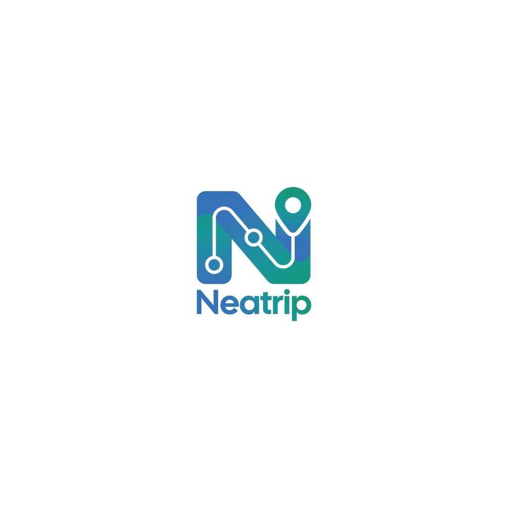
Neatrip Logo
Vous souhaitez remporter un projet comme celui-ci ?
Ce client a reçu 1 designs de logo de la part de 1 designers. Il a choisi ce design de logo de Jerwin Intac comme design gagnant.
Inscrivez-vous Trouvez des Projets de Design
- Garanti
-
 £80
-
 1 design
-
 1 designer
Brief de Design de Logo
I have an AI designed logo for an Android/iOS app. I really like the logo but it was created as a PNG and I need a freshly drawn SVG file. Conversion doesn't work without adding artefacts or messing with the original design. AI also added some flaws to the original that I do not like.
I've attached the original for inspiration. It does not need to be a 1:1 replica, I'm open to improvements.
Here is the spec of what I need:
-I need two SVGs, one of the full logo and another 1:1 ratio one of just the 'N'
- I need to adjust the colours The gradient needs to start at #0B78E8, pass through #0E9696 and end on #109570. Every stop of the gradient must reach at least 3:1 contrast against both #F4F6FB and #070B14.
- The background must be transparent
- The word Neatrip mut be in alignment with the left hand and the right hand of the N,
- I'm not worried about which fonts you use.
- The right hand tip of the N is meant to represent a tear drop style place marker. It needs to transition smoothly from the N with some space separating the edges just like the sample file. The sample file has some smoky colour between the N and the place marker, this isn't necessary, clean space is fine. The transition from the N to the place marker in the sample file is not symmetrical, it looks odd, please rectify this.
- The logo needs to have the line and circles running through it similar to the design, this is mean to represent stops on a journey similar to a train line map. Placement does not need to mimic the logo, place them wherever makes sense to your design eye. The line and dots can follow the N precisely if you want
- the logo needs to be boxy, meaning all sides are in alignment, nothing protruding above,.below, left or right including the word below. The current sample shows this
-Text converted to outlines, so the "Neatrip" wordmark doesn't depend on a font being installed.
-No embedded pictures (bitmaps) inside the SVG, only drawn shapes, so it stays sharp at any size.
-The gradient defined in the SVG itself
Marché(s) Cible(s)
Consumer app
Secteur / Type d'entité
Travel planning app
Texte du logo
See brief
Styles de police à utiliser
Autres polices appréciées:
- Designer choice but modern
Aspect
Chaque curseur illustre les caractéristiques de la marque client et le style que doit transmettre votre design de logo.
Élégant
Audacieux
Léger
Sérieux
Traditionnel
Moderne
Sympathique
Professionnelle
Féminin
Masculin
Coloré
Conservateur
Économique
Haut de gamme
Exigences
Doit avoir
- See brief
Bien d'avoir
- See brief
Ne doit pas comporter
- See brief
